Corporate events - 2023–2025
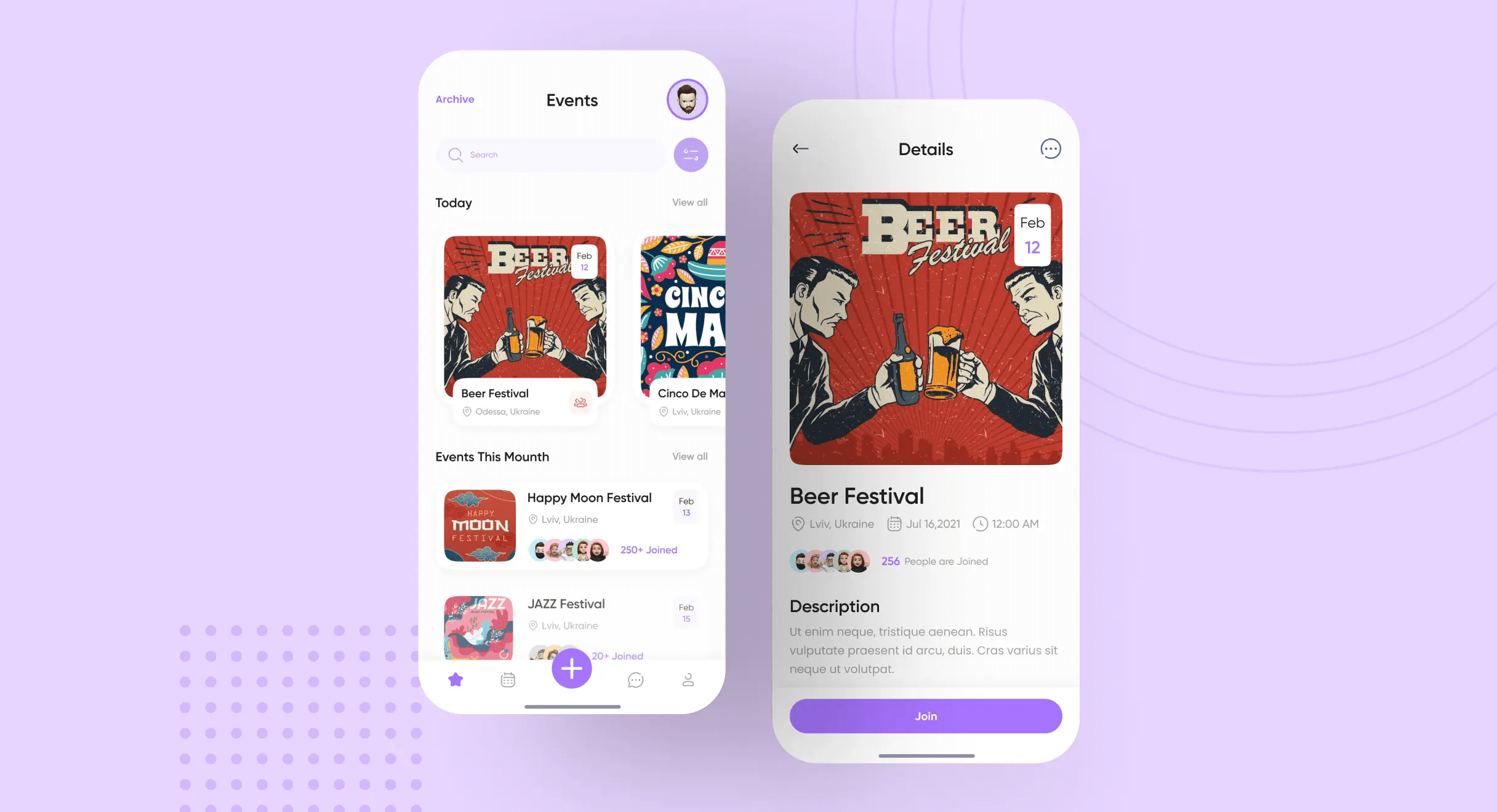
A mobile app for creating and joining internal team events, split into two views: one for the person organizing, one for the person deciding whether to show up.
The problem
Corporate event apps tend to accumulate functionality - chat, polls, integrations, notifications, calendar sync, attendance tracking - until the core action of creating or joining an event is buried three taps deep. I was asked to build GoodTeam for internal team events, not public ticketing, and given one constraint to defend the whole way through: no feature bloat.
Approach
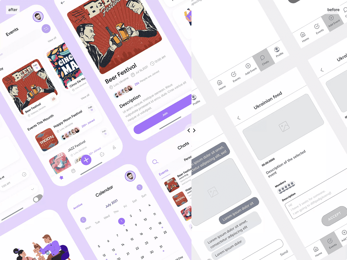
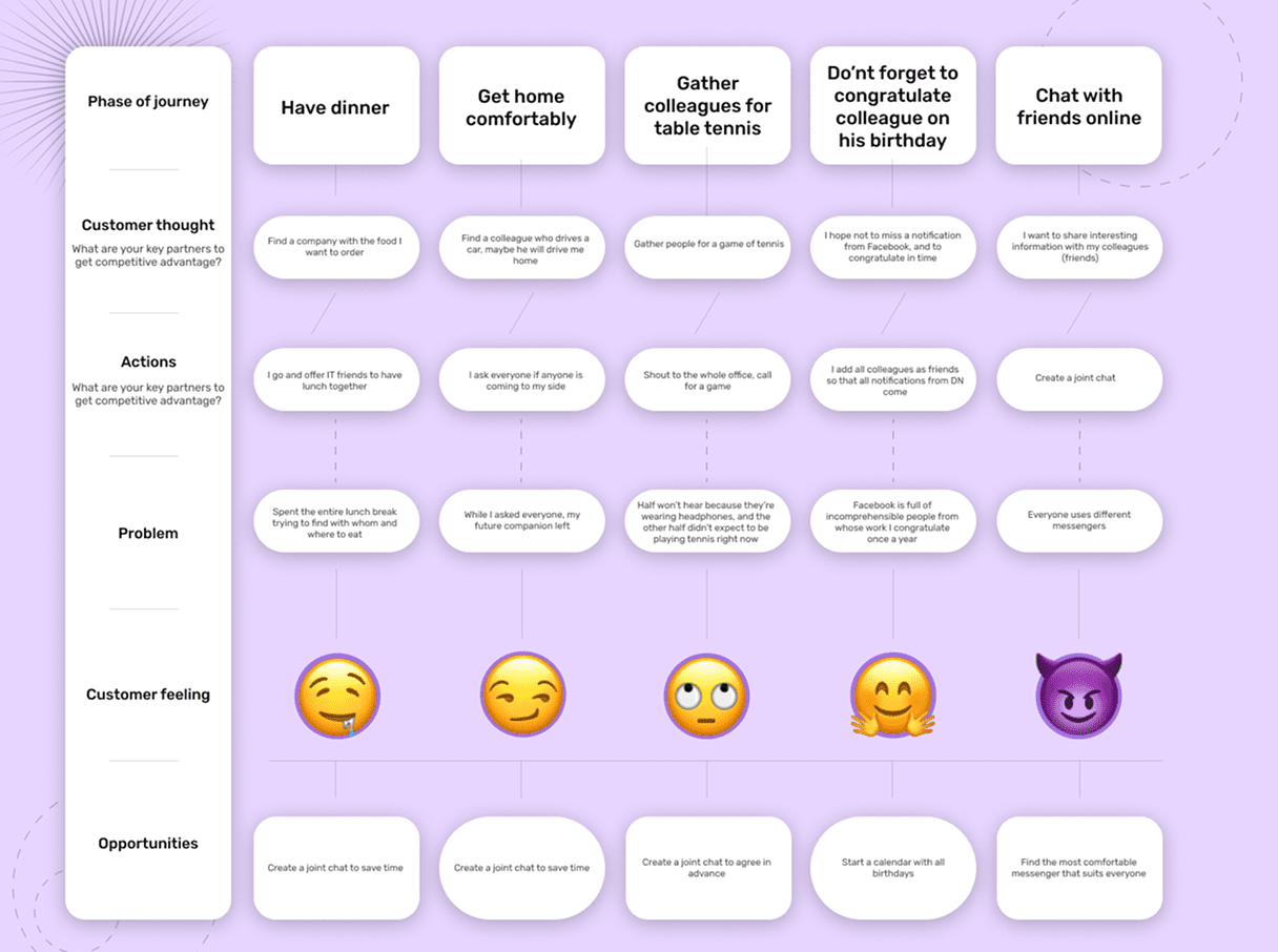
The process started by identifying the two jobs the app needed to do exceptionally well - organizing an event and responding to one - and treating everything else as supporting context. I mapped how people already coordinate outside of dedicated apps, things like a lunch, a ride home, a birthday reminder, a game of table tennis, to see where the real friction sat. Only after the navigation structure was prototyped and validated internally did I move on to individual screens.
Personality
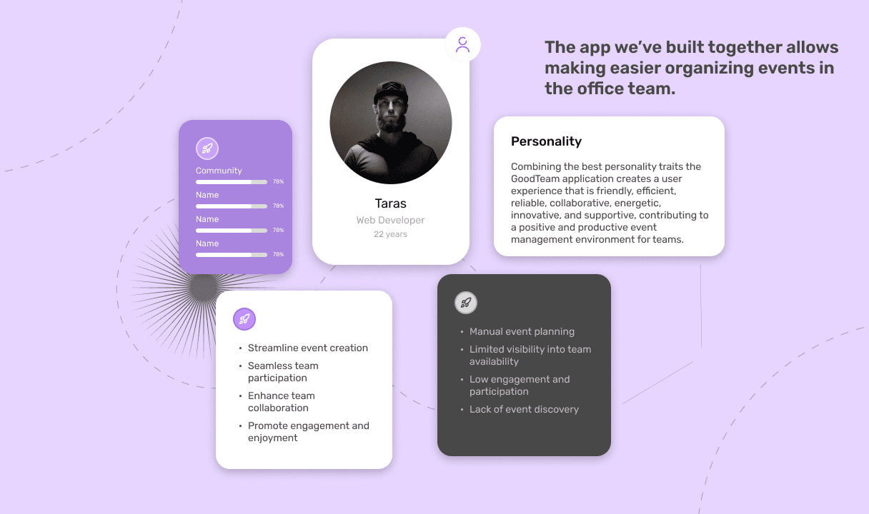
The visual language runs on soft shapes, generous spacing and a warm palette, aimed at one specific reaction: opening GoodTeam shouldn't feel like opening corporate software. Every microinteraction confirms what just happened, so a host who published an event or a teammate who tapped RSVP can tell the action actually landed.
One app, two jobs. Organizing and attending never share a screen.
Two-mode architecture
The app's structure mirrors how people actually use event tools - you're either the person creating something or the person responding to it. Organize mode gives hosts a fast path to set up an event, invite people and track who's answered. Attend mode gives team members a feed of what they've been invited to, with one-tap RSVP and the option to open an event for more detail. Switching between the two is meant to feel like switching contexts in your head, not hunting through a menu.
Scope discipline
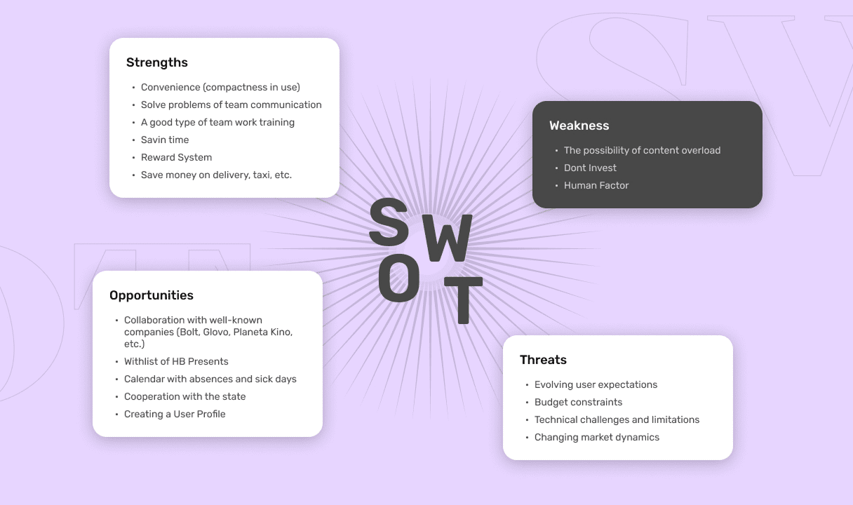
Before I drew a screen, I ran a SWOT analysis of the GoodTeam concept against existing corporate event tools. The strengths were real - a tightly defined use case of internal events, not public ticketing, and room to compete on simplicity instead of feature count. So were the weaknesses: a crowded market, and no strong reason for a team already living in Slack or Outlook to switch. Every feature proposal after that got tested against one question - does this solve a real internal-event problem, or is it a copy of Eventbrite?
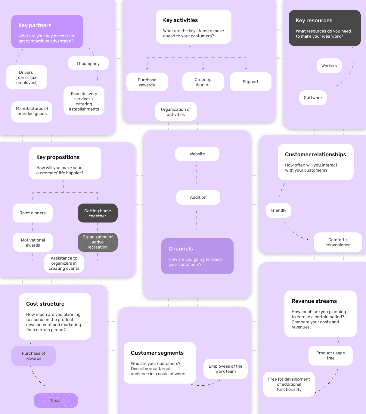
I mapped the Business Model Canvas too, mostly to keep design decisions honest about how the product would work day to day: a narrow customer segment of mid-sized companies with distributed or hybrid teams, and a value proposition built on speed - event creation faster than writing a Slack message, RSVP simpler than replying to an email. The canvas's revenue and cost sides shaped what I deliberately left out: no in-app payments, no premium feature gates, no analytics dashboard beyond what an HR coordinator would actually use.
Discovery
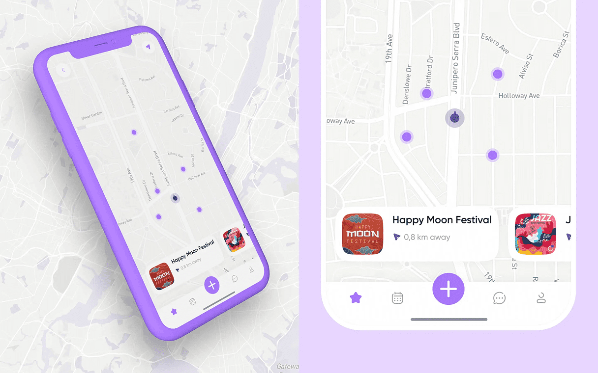
For hybrid teams or companies spread across offices, an interactive map surfaces events geographically - what's happening nearby, filterable by date or category, tappable straight into event details. It's built as a discovery layer, not a primary navigation element, so it stays useful without turning into the app's centerpiece.
Creating an event
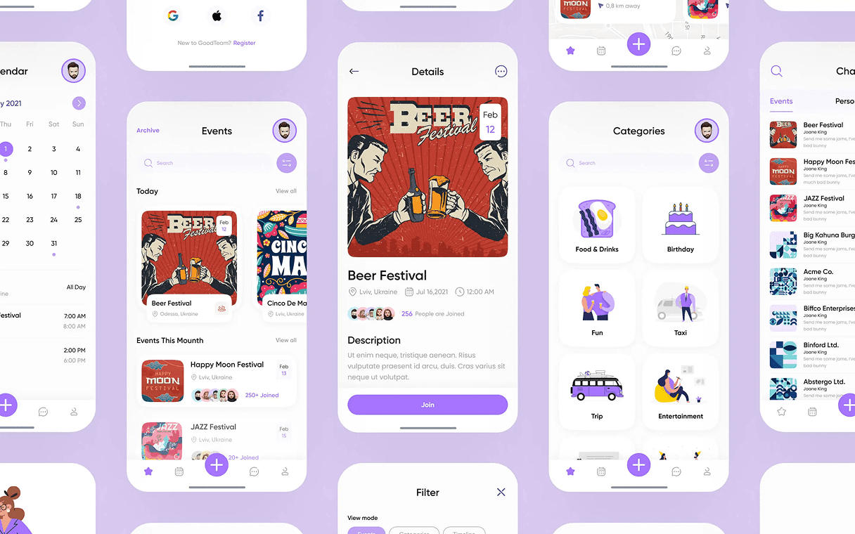
Event creation guides a host through the essentials - name, date, location, participants - before progressively revealing optional fields like agenda, notes or attachments. The same form covers a two-line lunch invite and a fully-detailed offsite; there's no separate "simple" and "advanced" mode to choose between first.
Organized messenger
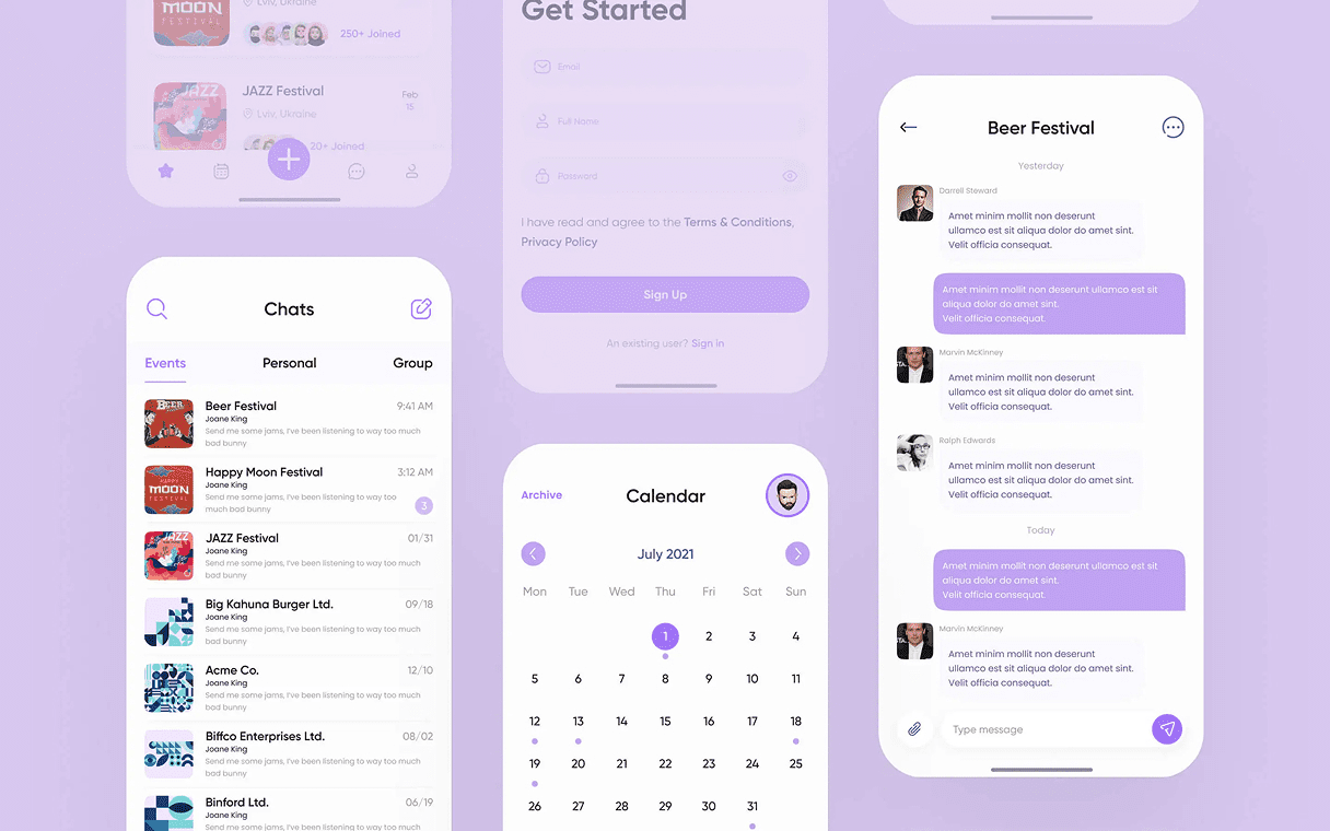
Each event gets its own chat thread, scoped to its participants and tied to the event's lifecycle. Conversations stay about the event instead of bleeding into a general team channel, and once the event is over, the thread archives on its own. It's a small mechanic, but it answers the most common complaint about team chat apps - that messages from last week's lunch are still pinging you a month later.
Process
Mapped everyday coordination moments - a dinner, a ride, a birthday - into a journey to find where existing tools actually failed.
Ran a SWOT and a Business Model Canvas to decide, on paper, what GoodTeam would not do.
Prototyped the navigation first, then built the two-mode architecture and visual language around it.
Delivered organize, attend, map discovery and per-event messaging as one connected system.
Design decisions
Split the app into two modes instead of one shared flow.
Organizing and attending are different jobs with different urgency - a host needs a form, an invitee needs one tap. Keeping them as separate modes let each stay fast at its one job instead of compromising for the other.
Used one event form for a two-line invite and a fully-detailed offsite, revealed progressively.
A simple/advanced toggle is itself a decision a host has to make before making the one they actually came for. Starting with name, date, location and participants, then revealing agenda and attachments only when needed, let a basic event publish fast without capping what a bigger one could hold.
Scoped features against a SWOT and a Business Model Canvas, and left out payments, premium gates and analytics.
A crowded market with low switching incentive punishes bloat more than it rewards extra functionality. Writing down what the product wouldn't do kept every feature proposal accountable to a real internal-event problem instead of a competitor's feature list.
Outcome
GoodTeam shipped as a UI/UX design system organized around two user intents - organize and attend - with everything else, the map, the messaging, the event details, nested as sub-flows that surface only when relevant. The home screen makes it clear at a glance whether you're creating an event or responding to one, instead of routing both through the same generic list.