EdTech / Language learning - 2023–2025
An iOS app for building your own vocabulary lists - from a film script, a textbook, a song - and testing yourself against them until the words stick.
The problem
This app doesn't teach a set curriculum. Every list is built by the person using it, out of whatever they're already reading or watching - a film script, an economics book, a UX writing book, a song. I started with research into how people actually retain new vocabulary, not just how they look a word up, and that research pointed at the real risk: users add a word once and never come back to it.
The design problem was less "how do we teach vocabulary" and more "how do we get someone to reopen a list they made three weeks ago, and how do we make that list still make sense to them when they do."
Approach
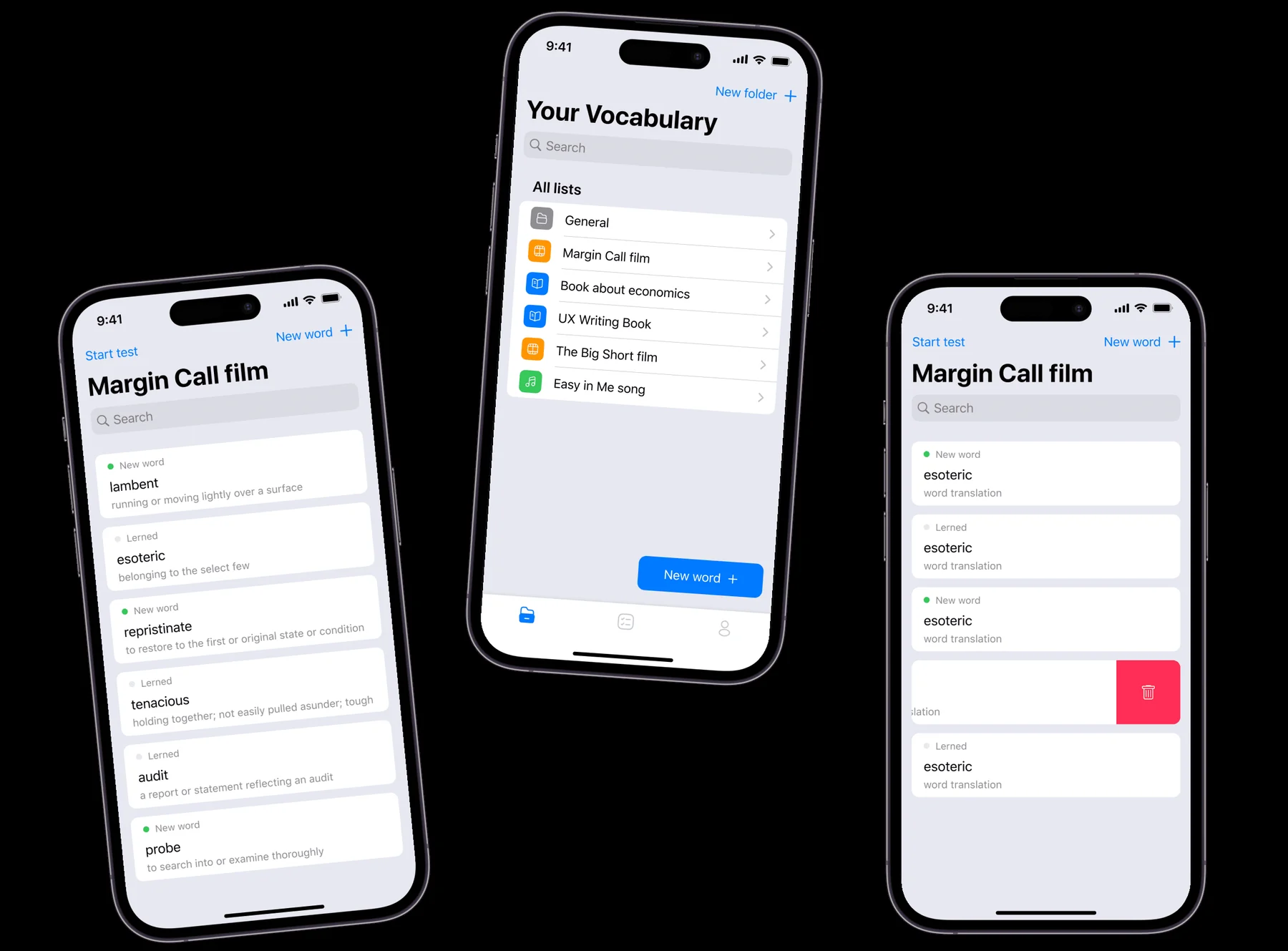
The interface follows iOS guidelines for navigation and interaction, built for small screens with a clear hierarchy between a folder, a list and a test. Working alongside the mobile developers, I designed the AI-assisted word search, the folder structure, and the testing system as one connected flow rather than three separate features bolted together - the AI's job is to speed up adding a word, not to decide what the user should learn.
A vocabulary built from whatever you're already reading. Not from a syllabus.
Adding a word
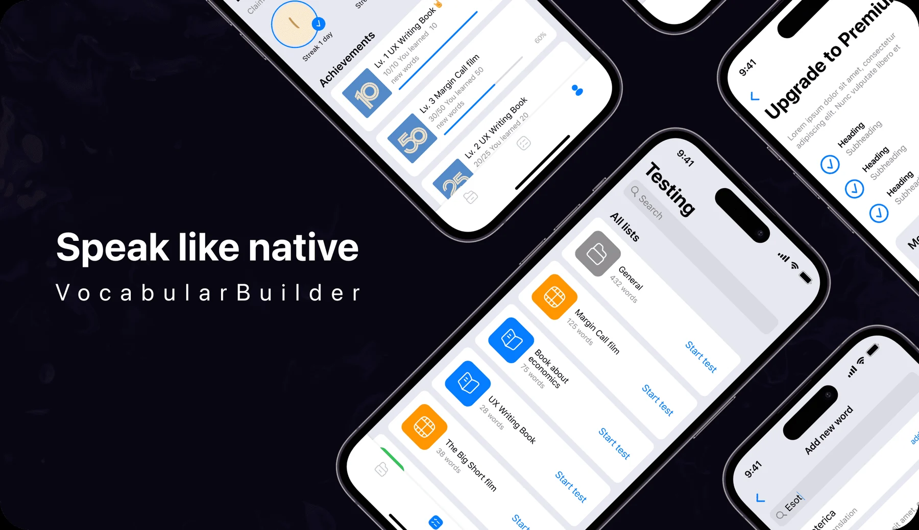
Typing a word into search runs it against a built-in dictionary first: "esoterica," "esotropia" and "esophagus" show up as matches, each with an "add word" action that fills in the definition automatically. A word already sitting in the list is marked "Already in list" instead of being offered again. Only when nothing matches does the app drop the user into a manual form - term and a hand-typed definition - so writing your own definition is the fallback, not the default.
Process
App launch branches to sign-up or log-in, both handled through Apple ID or Google.
Search checks the built-in dictionary first; a match fills in the definition, no match falls back to a manual entry.
The word lands in a folder - general, or one named for the book, film or song it came from.
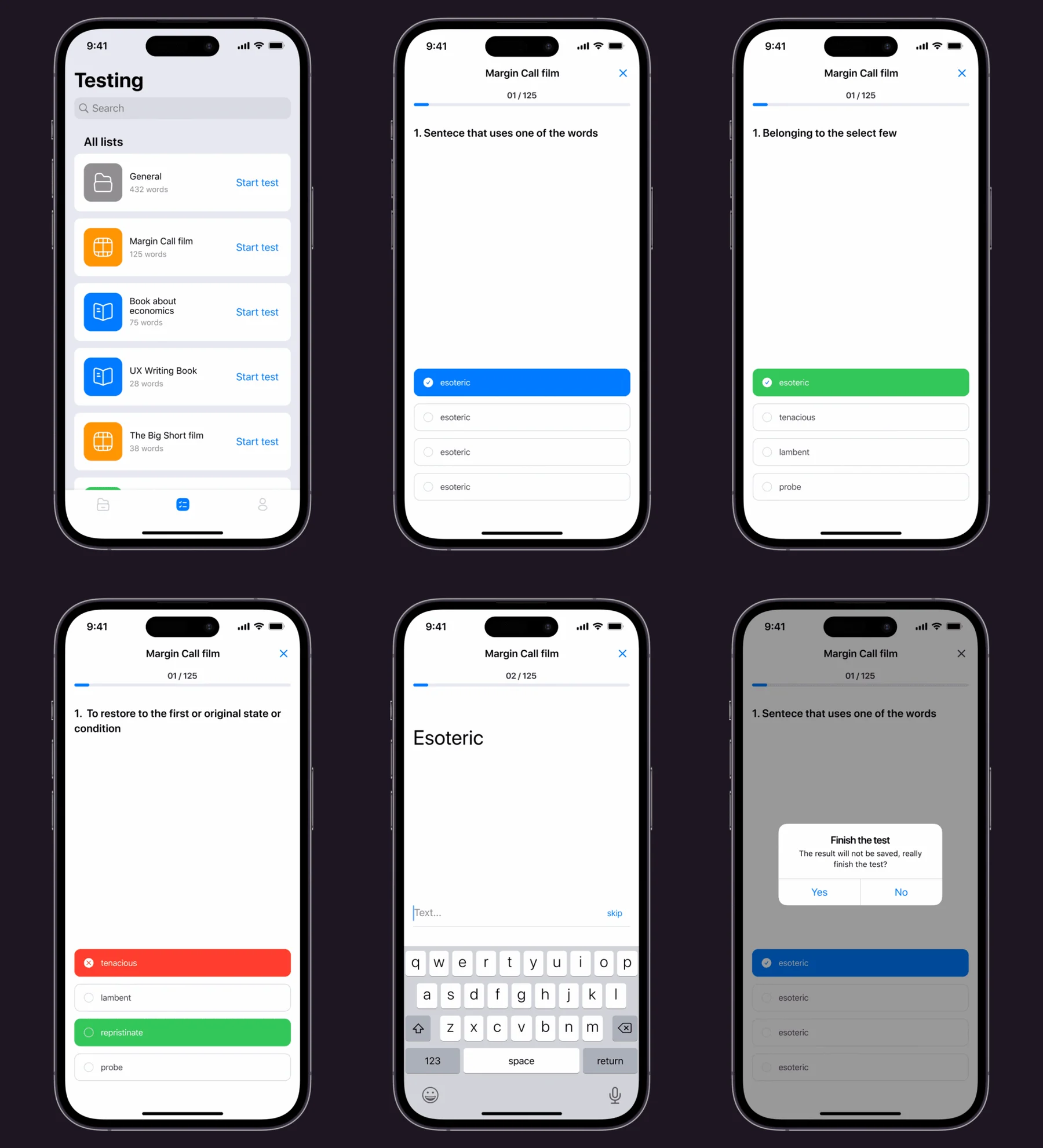
A test pulls from that folder's words in mixed question formats, and the result only saves if the test is finished.

Testing
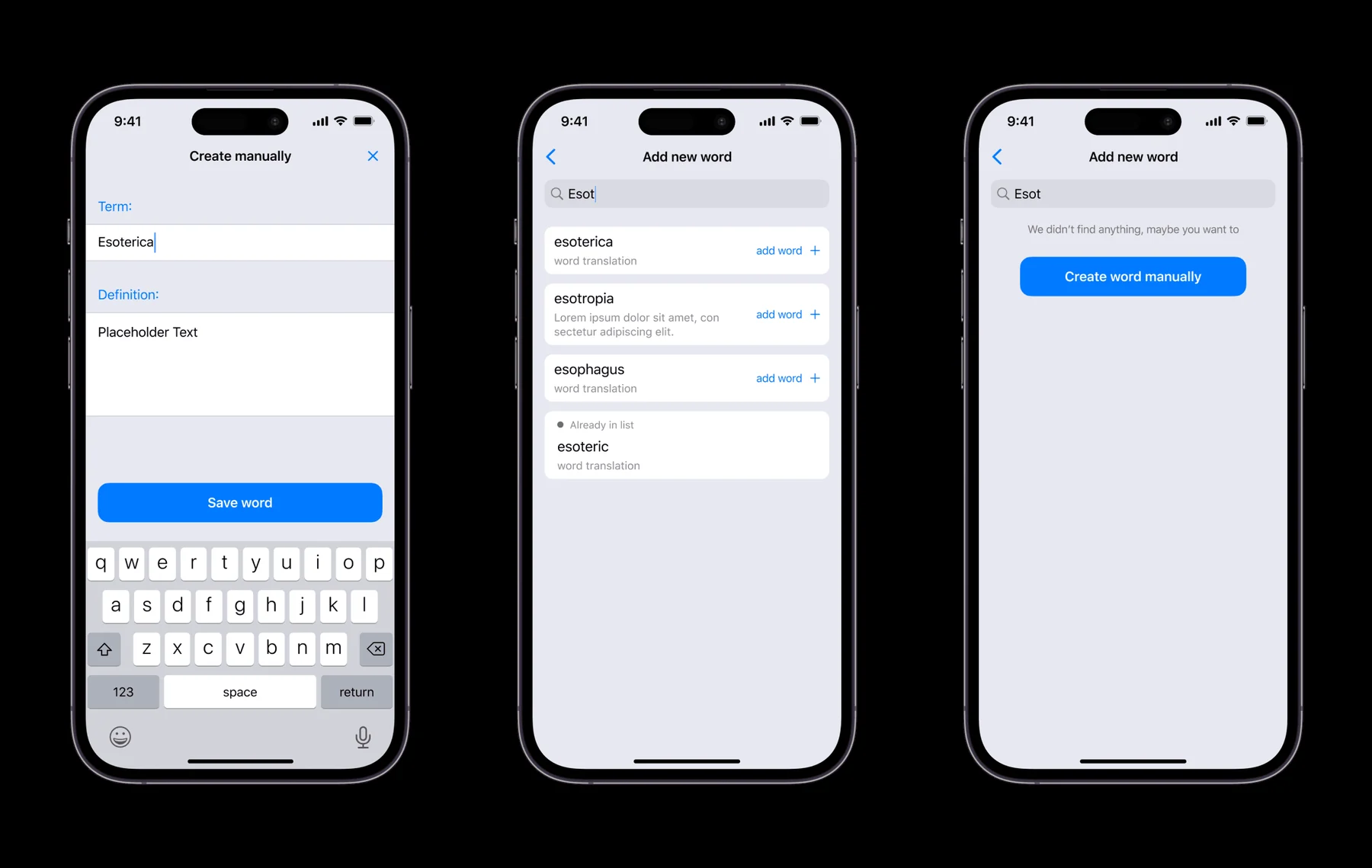
Starting a test from a folder - "Margin Call film," 125 words - opens a numbered sequence that doesn't stick to one question type. Some prompts show a definition or a sentence built around the word, with four options to pick from; others drop into a free-text field where the user has to spell the word themselves, with a "skip" if they're stuck. Trying to leave before the last question triggers a confirmation that the result won't be saved - a small piece of friction aimed at the person who's three questions in and about to bail.
Design decisions
Organized the home screen into folders named after the source material, instead of one master word list.
"125 words" from Margin Call film means something specific and gives someone a reason to reopen it. A single running list of every word ever added wouldn't carry the same pull back in.
Made the dictionary search the default way to add a word, with manual entry only as a fallback when nothing matches.
Writing a definition by hand is slower and more error-prone than picking a matched entry. Putting the AI lookup first keeps adding a word a five-second action instead of a small essay.
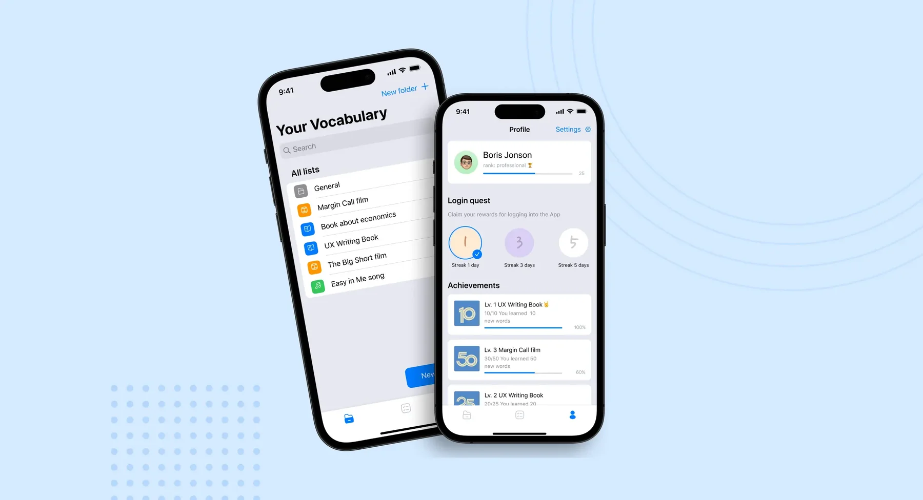
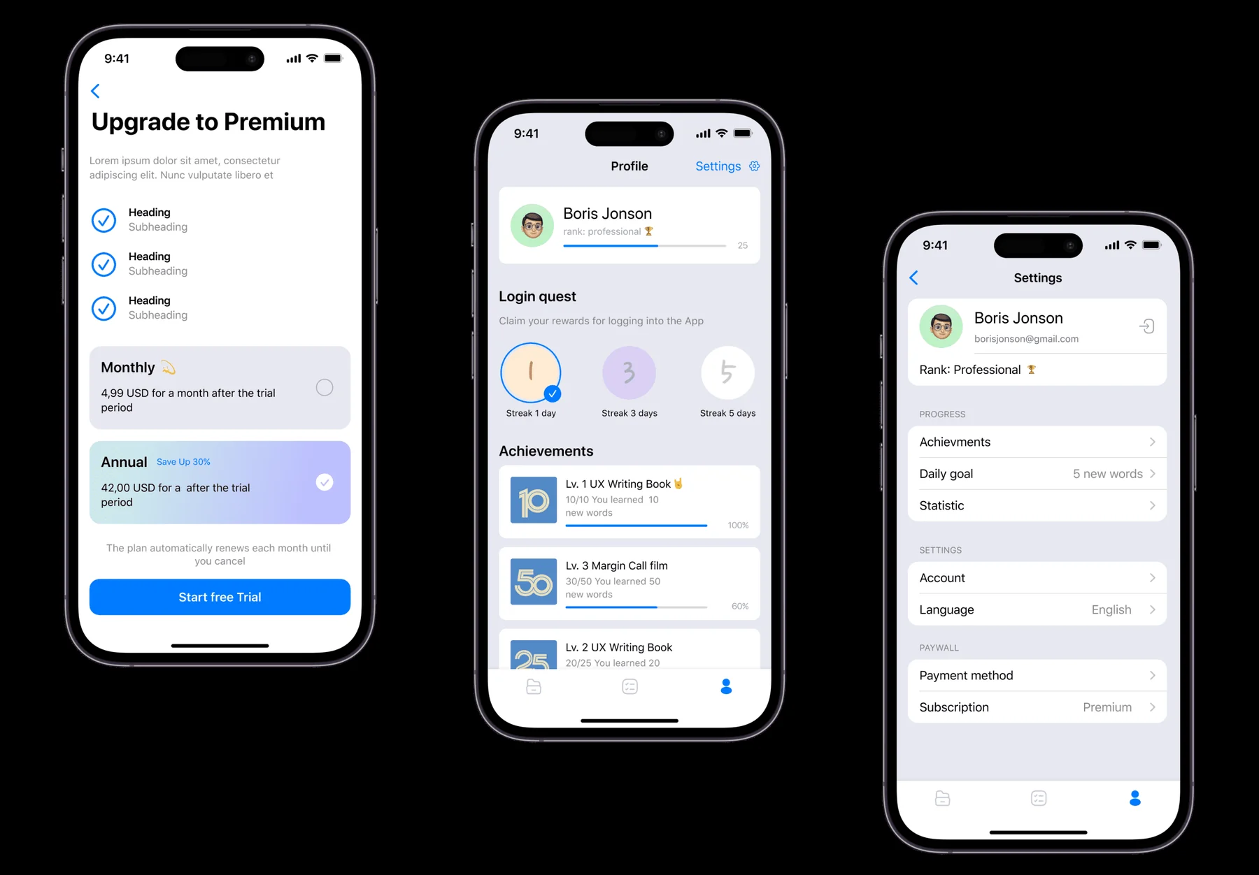
Built the return mechanic into the profile itself - a login streak, a daily quest, and per-list achievement bars - rather than leaving progress buried in a stats screen.
A learning app is only useful if people open it again. Surfacing "Streak 3 days" and "30/50 words learned" on the profile a user already checks makes progress visible without a separate reason to go look for it.
Outcome
What shipped is registration, folder-based word lists, an AI-assisted add flow with a manual fallback, mixed-format testing, and a profile built around streaks and achievements, sitting behind a monthly or annual subscription. Later design passes cut the number of steps to find information, enlarged buttons and controls, added clearer navigation paths and made the text easier to read - changes that came out of testing the app with real users rather than guessing at what would help.