Quantum computing / Developer tools - 2026
A workbench for superconducting quantum computers, where one project can be opened as circuit code or as the microwave pulses that physically run it.
The problem
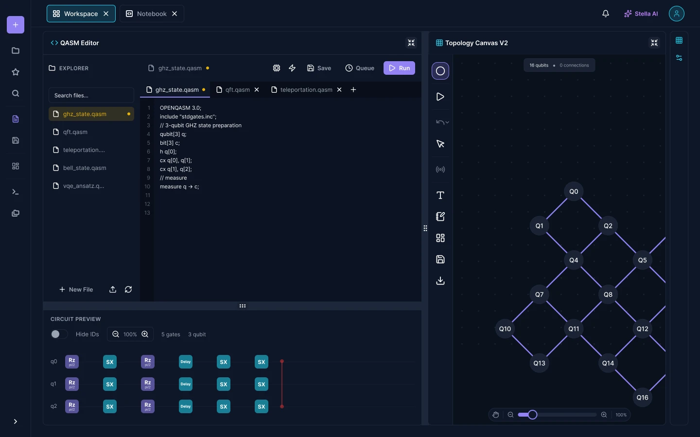
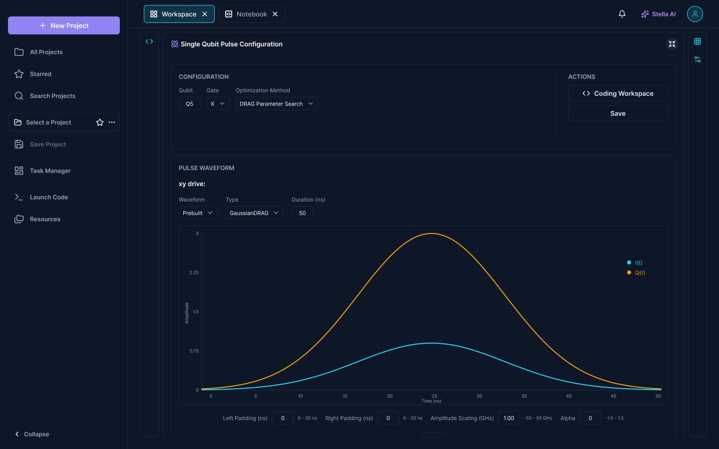
The people using this do not agree on what a quantum program is. To someone writing an algorithm it is a dozen lines of OpenQASM and a diagram of gates. To someone calibrating the machine it is a microwave envelope measured in nanoseconds, with an amplitude, a width and a correction term that decides whether the gate works at all.
Both descriptions are the same run. Tools in this field usually pick one of them and send you somewhere else for the other, so the handover happens in a private notebook and stops being part of the project.
Approach
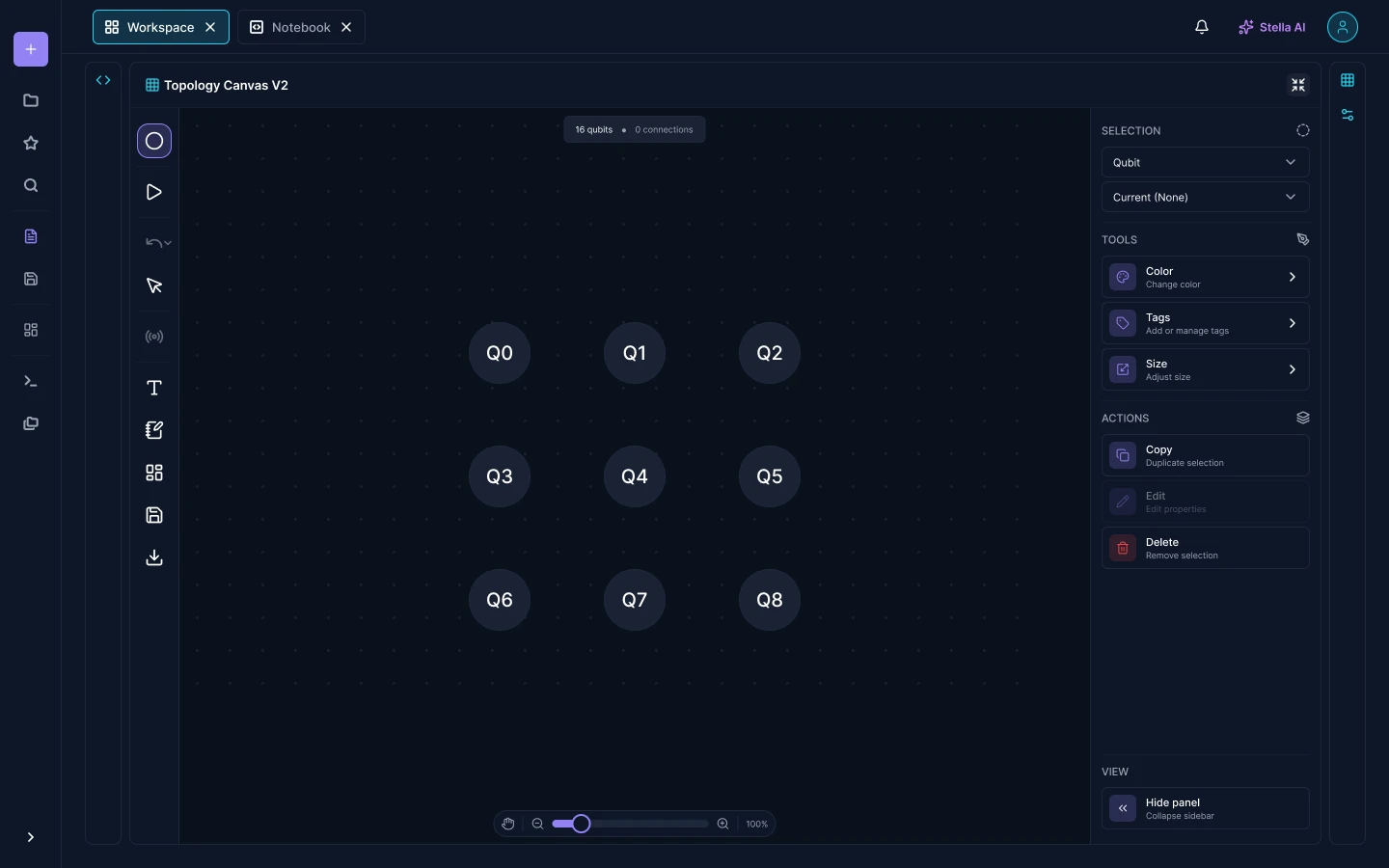
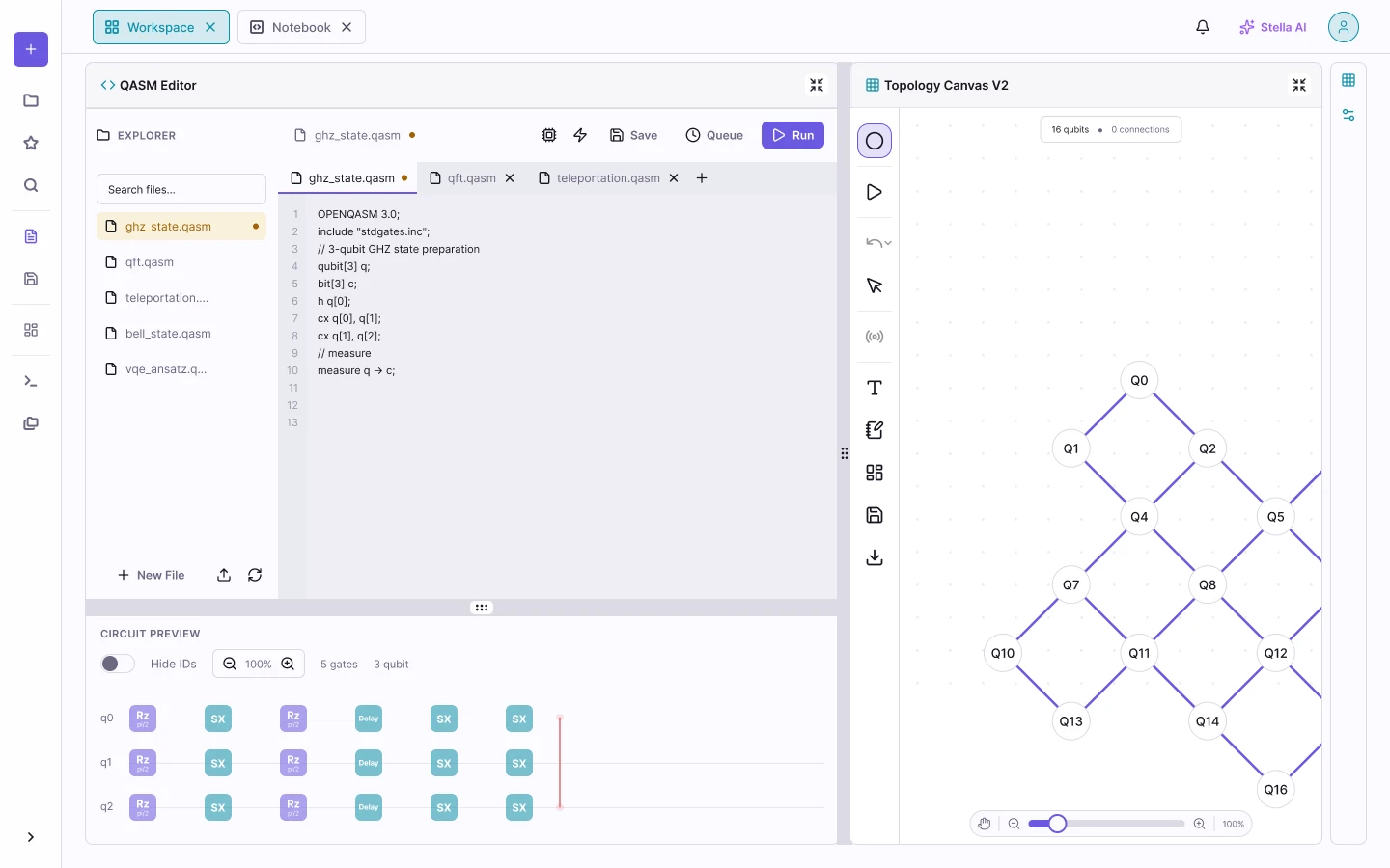
I did not split the product into a coding mode and a calibration mode. A project opens into a single workspace, and every tool is a panel on it that can be docked, collapsed or expanded to fill the screen. The editor, the circuit preview and the topology canvas are the same three panels whether you use all of them or one.
A pulse configuration opens over that same project, and carries a Coding Workspace button so the way back to the code is one click, not a navigation problem. Nobody has to choose their altitude when they open the app. They choose it per task, and change their mind without losing the run they were setting up.
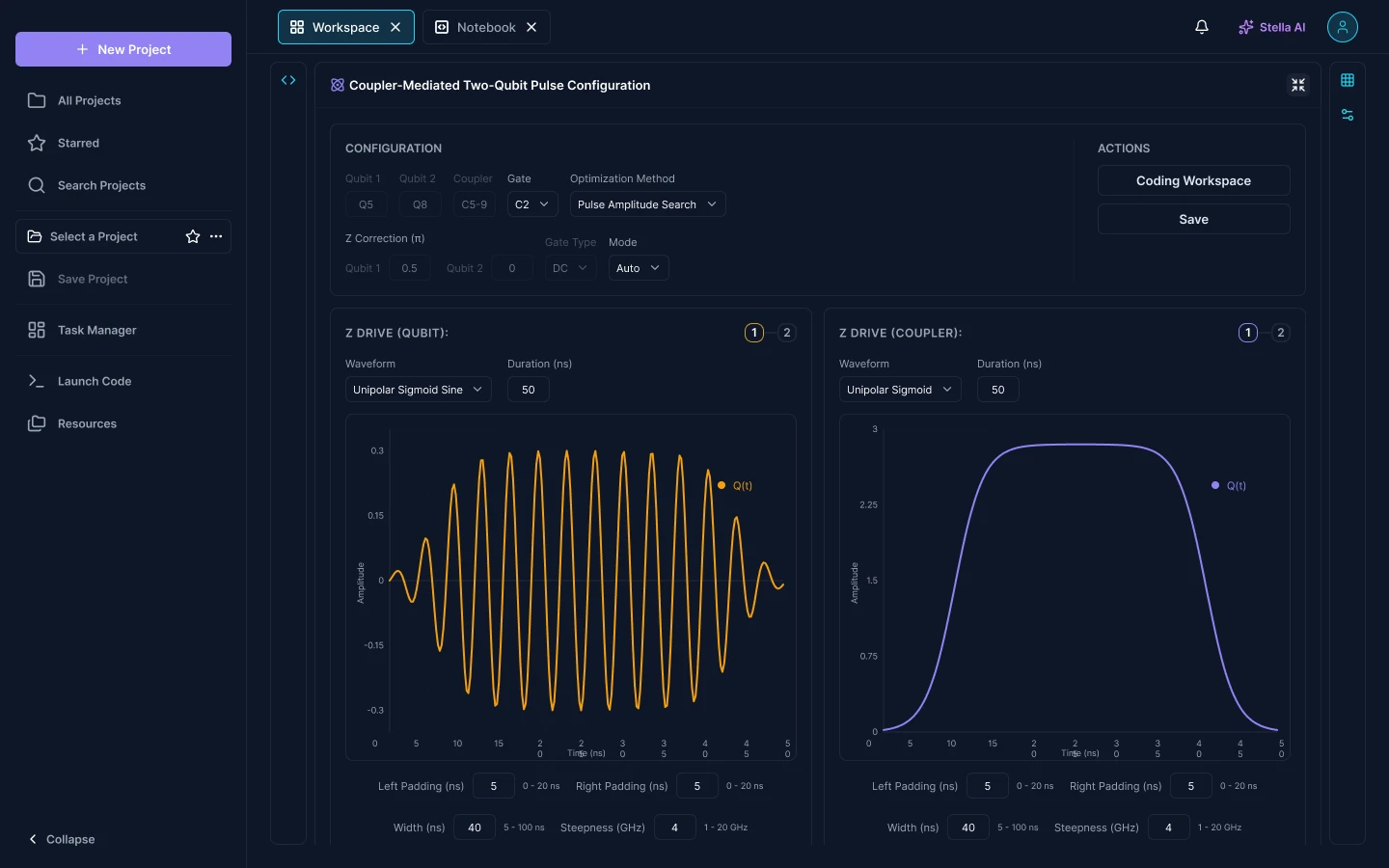
The same run, read at two altitudes. Code above, waveforms below.
Pulse configuration
Coupler-mediated calibration carries roughly three times the controls of the single-qubit version, and most of them are meaningless for a single-qubit gate. Opening it cold would be an ambush.
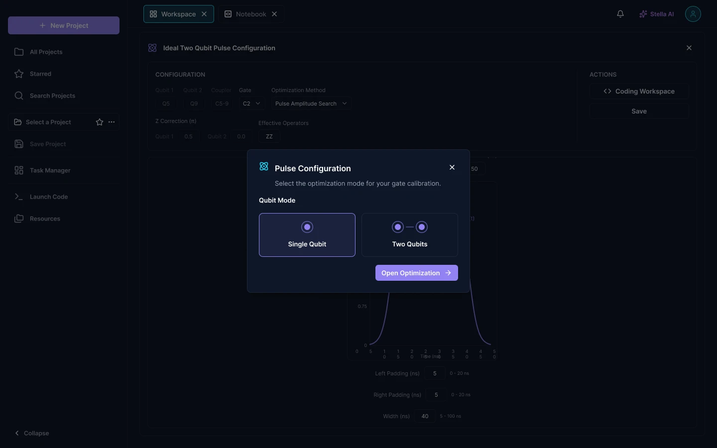
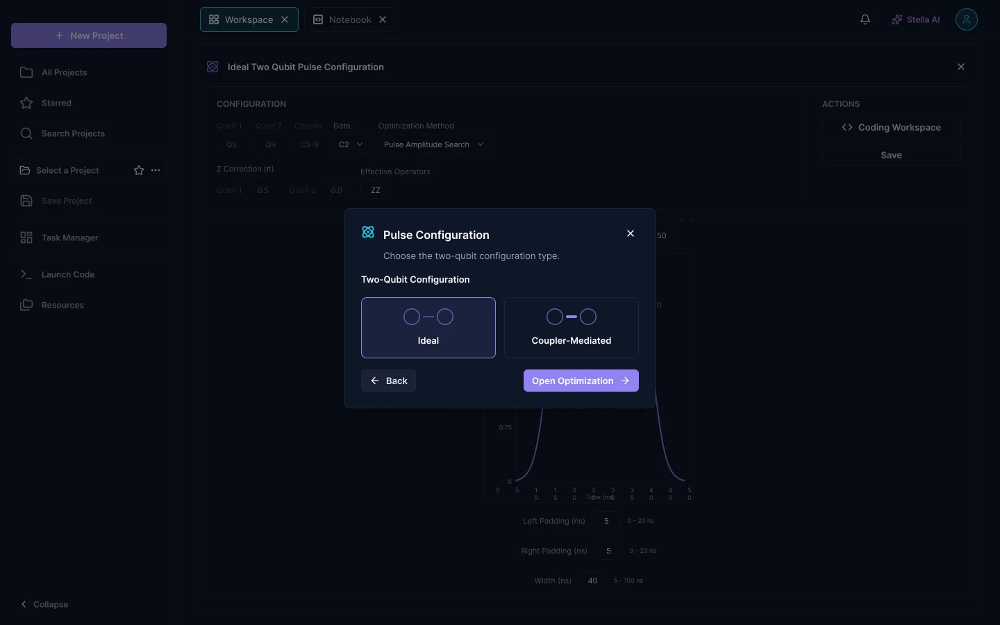
So the panel is never reached directly. Two small questions come first, each a pair of illustrated cards rather than a dropdown: single qubit or two qubits, then ideal or coupler-mediated. By the time the form appears, every field on it applies to the gate being tuned.
Project setup
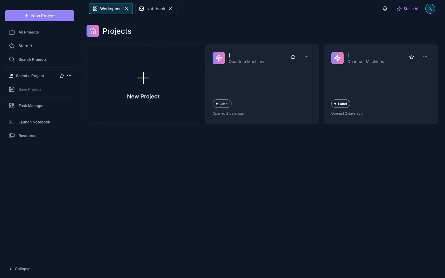
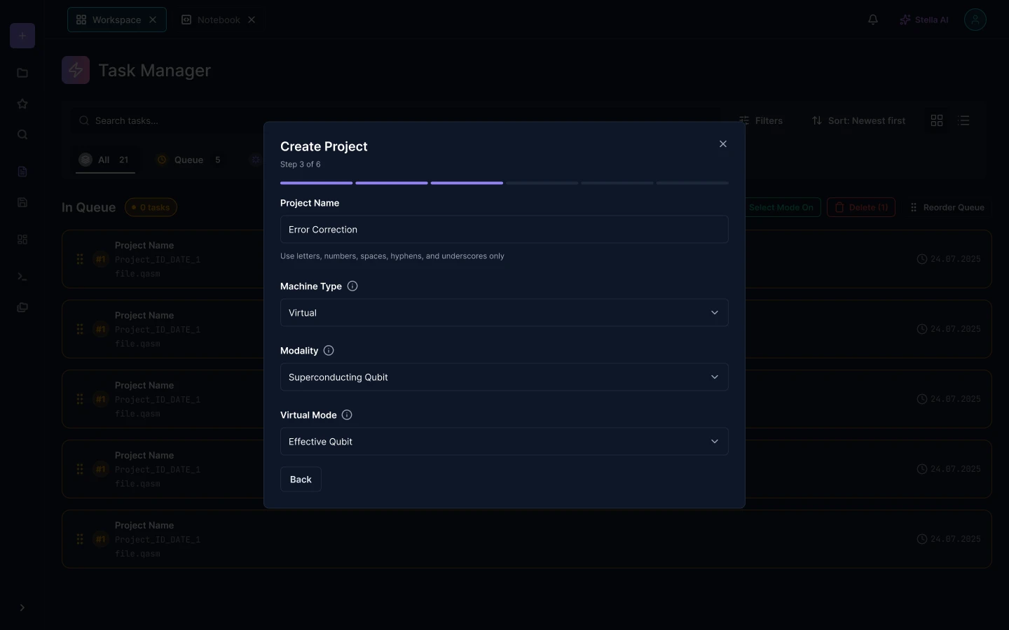
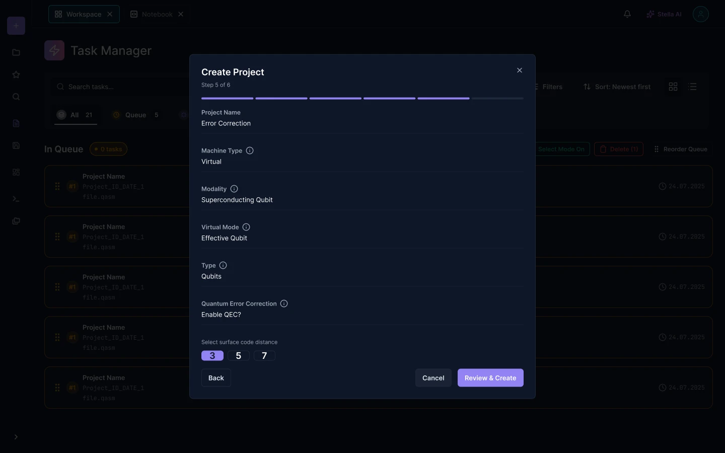
Creating a project is not one form. Machine type decides which modalities are available, modality decides which virtual modes exist, and error correction adds a surface code distance that only matters if it is switched on. Presented flat, most of those fields would be inert most of the time.
I broke it into a stepped dialog so each answer narrows the next, and put a full review before anything is created, restating every choice in one column. Setting up a run on shared hardware is worth reading back before it is committed.
Process
I read up on what a DRAG pulse, a coupler and a surface code distance actually are, because you cannot lay out a form whose fields you do not understand.
I mapped what the algorithm side needs against what the calibration side needs, and found the small set of screens both of them touch.
One project surface, panels that dock, collapse and expand, so the same workspace serves a three-line circuit and a full waveform tuning session.
Every screen was drawn dark and light from shared tokens, so the light theme is a real working surface rather than an inverted afterthought.
Design decisions
Pulse configuration is reached through two small choices, never opened cold.
The coupler-mediated form has roughly three times the fields of the single-qubit one. Asking qubit mode first, then ideal or coupler-mediated, means nobody is ever shown controls that do not apply to the gate in front of them.
Fields decided upstream stay visible, but locked.
In the two-qubit panel the qubit and coupler fields are dimmed rather than hidden. Hiding them would leave the reader unsure which pair they are tuning. Dimming answers that question and still says the choice belongs to an earlier step.
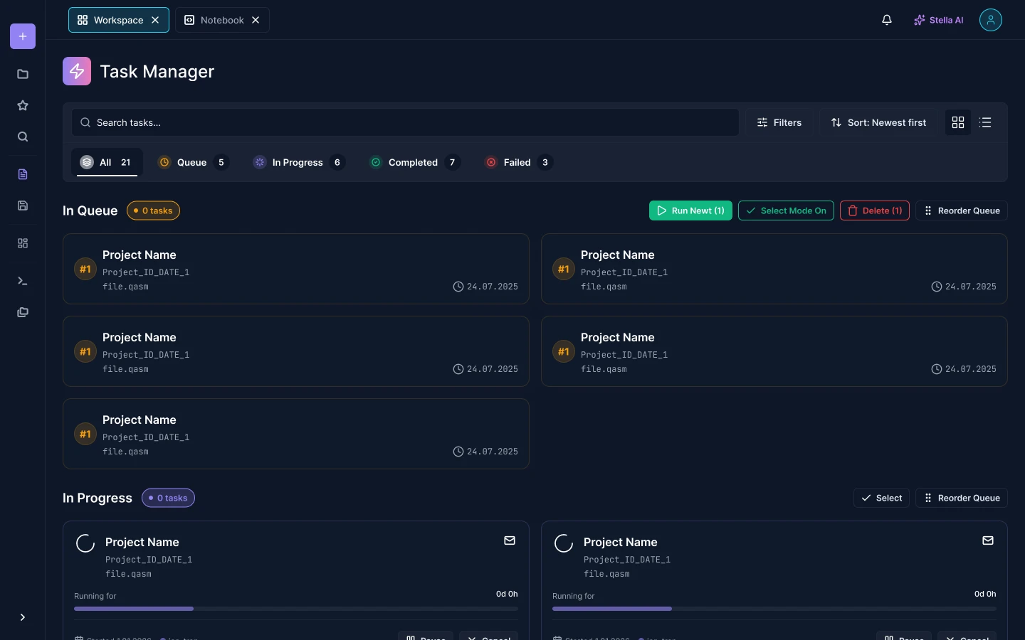
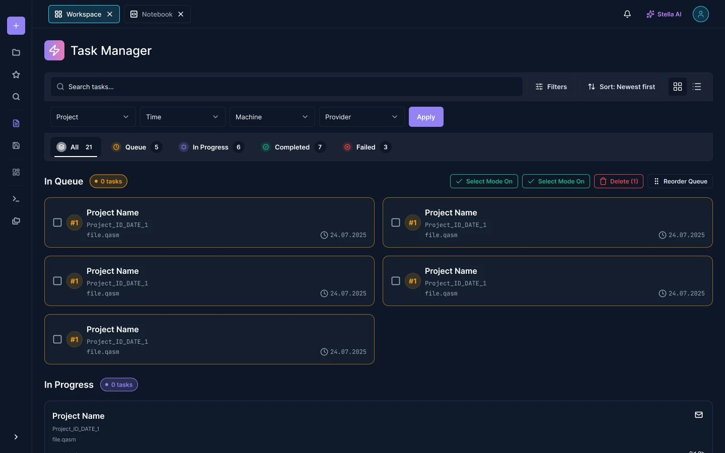
The queue is a screen, not a notification.
Quantum hardware is shared and slow, so a submitted run waits. Waiting deserved its own page: queued, in progress, completed and failed as separate counts, filters by machine and provider, and a queue that can be reordered by hand instead of only by submission time.
Assistance and themes
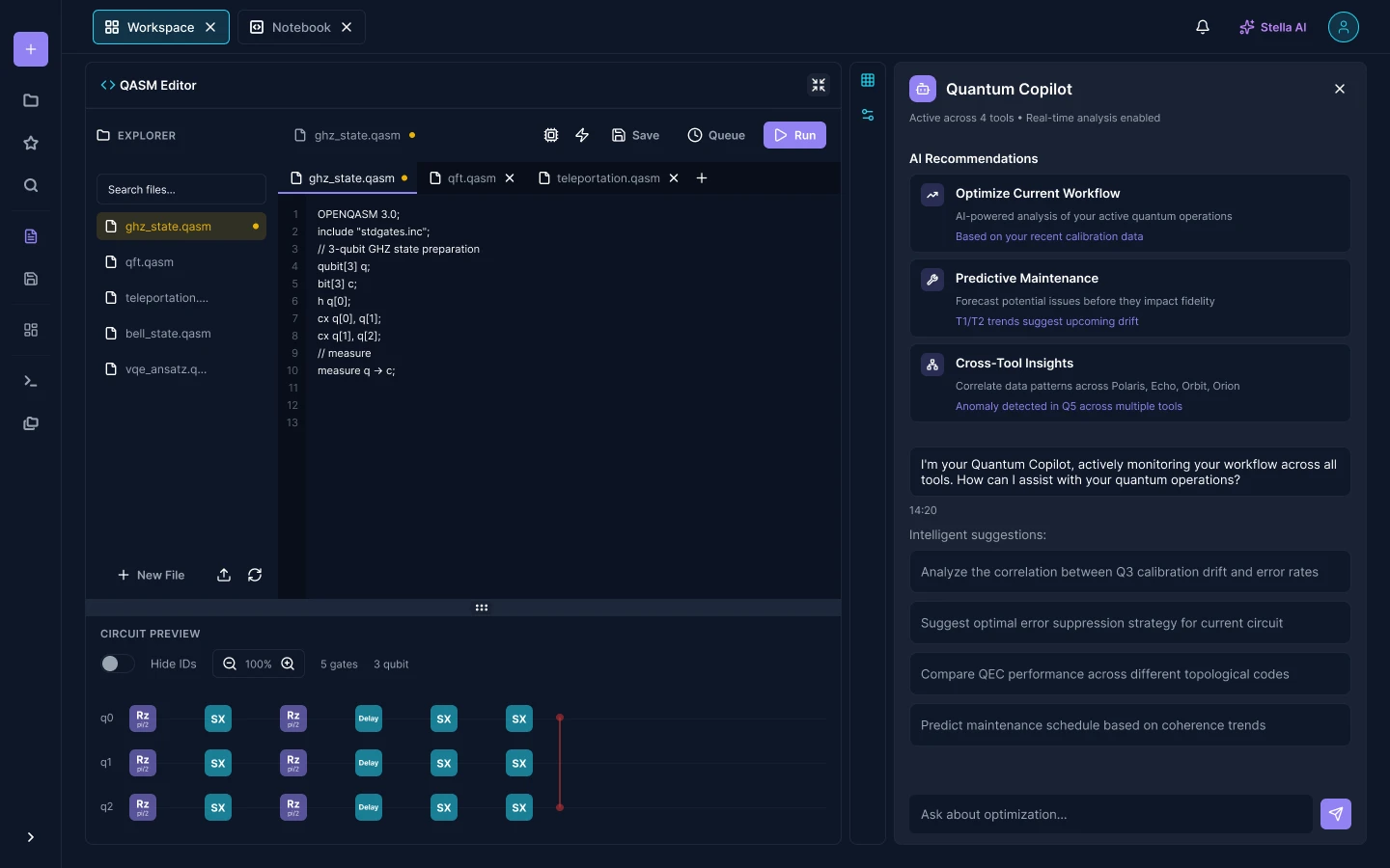
The assistant is a docked panel, not an overlay. It keeps the editor and the circuit visible while it reads them, and it opens with specific starting points rather than an empty prompt, because a blank box next to an unfamiliar domain gets closed rather than used.
The whole interface exists in dark and light. Physicists reading waveform plots have strong opinions about which one they want, and a plot on a light background is a different reading task, so both were drawn properly rather than generated by inversion.
Outcome
The product ships as one workspace covering the whole path: write the circuit, see the machine it maps onto, drop to the pulses when the gate needs tuning, queue the run and watch it wait. The two audiences that normally use separate tools now leave their work in the same project, where the other one can find it.
Both themes and every state, from onboarding to cancellation, were designed as one system rather than as screens collected over time.