Food service, hospitality tech - 2023–2025
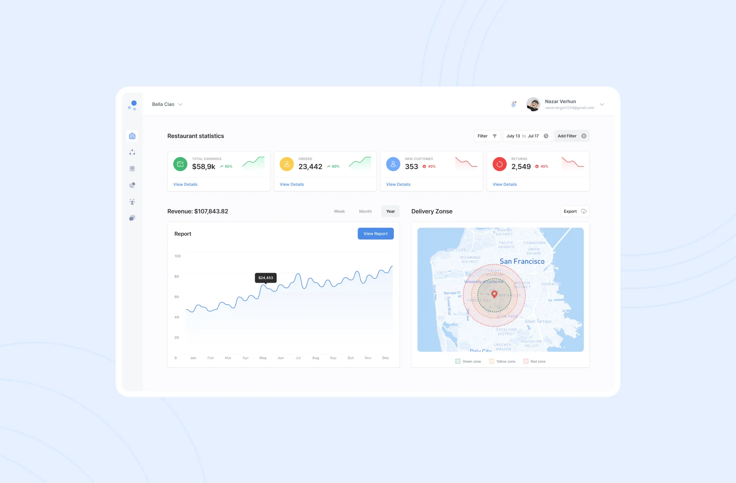
A web dashboard for running a restaurant's menu, orders, inventory, staff and delivery from one place - built to stay legible when the person reading it is standing up, mid-shift, with three things happening at once.
The problem
Before DineEase, a single order could touch a separate menu system, a card reader, a staff roster and a delivery tracker - four places to check when a table is waiting or a courier hasn't shown up. I researched restaurant operations across formats, from a fast-casual counter to a fine-dining floor, to find where the handoffs between those tools actually broke, since what a counter needs at lunch rush isn't what a dine-in floor needs at dinner service.
The brief was to fold five jobs into one dashboard: setting up the menu and delivery rules before service, taking and tracking orders during it, and reading the numbers back at close.
Before service - setup
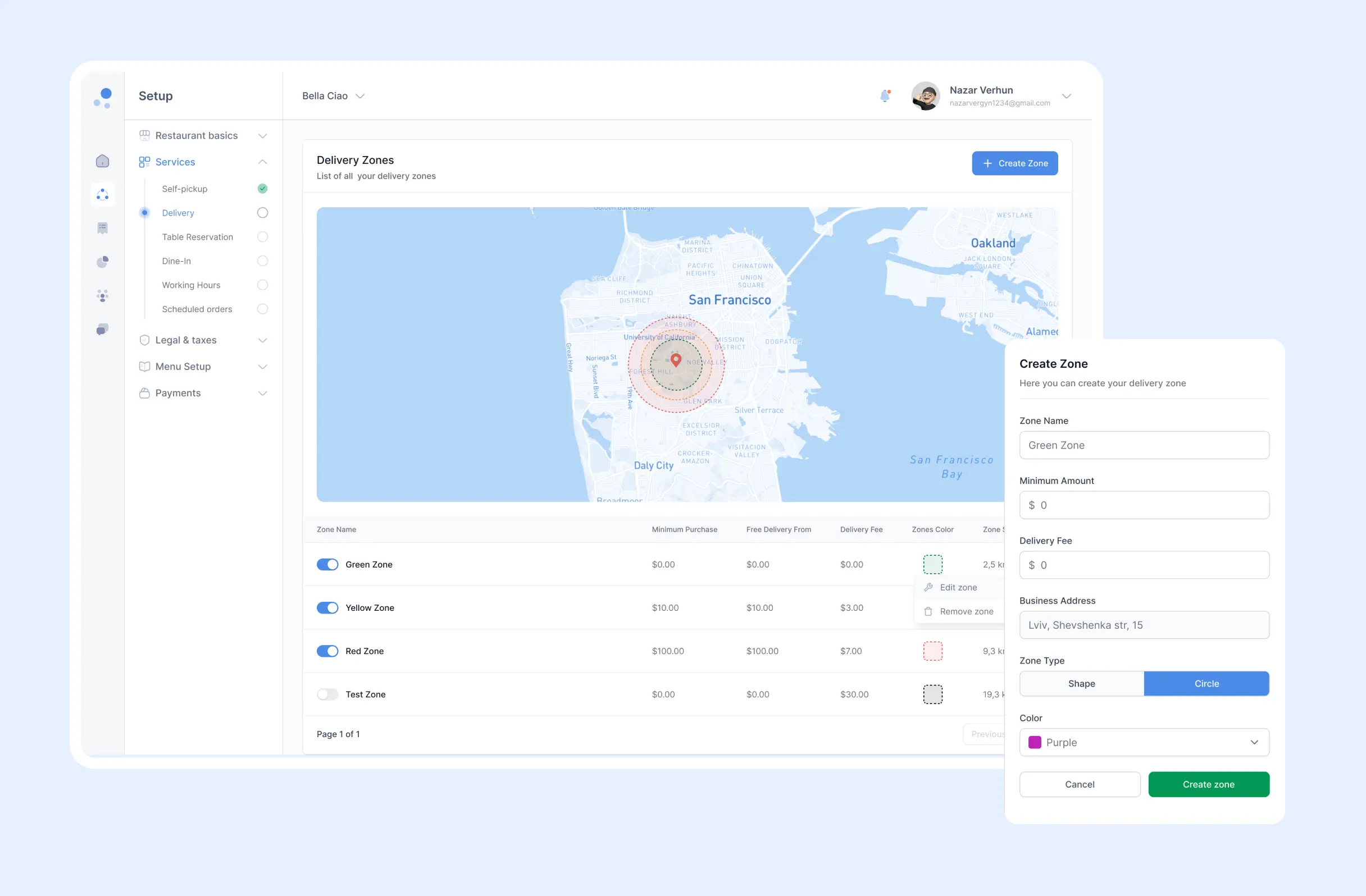
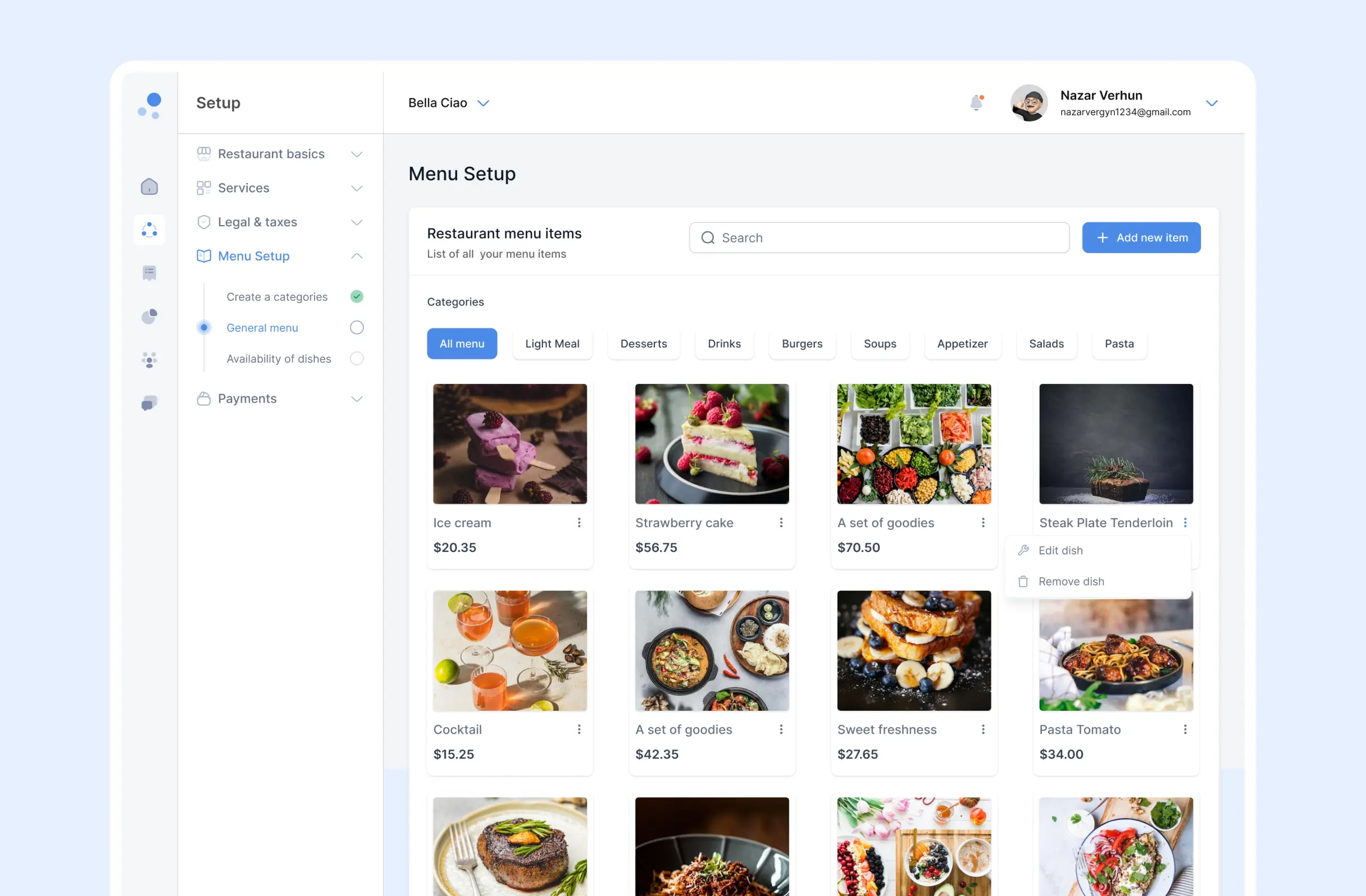
Setup is what an owner configures once, before opening, and staff then depend on for the rest of the shift: restaurant basics, which services are offered (self-pickup, delivery, table reservation, dine-in), legal and tax details, the menu, and payments. Two of those screens carry the most day-to-day weight - the delivery zone map and the menu itself.
Approach
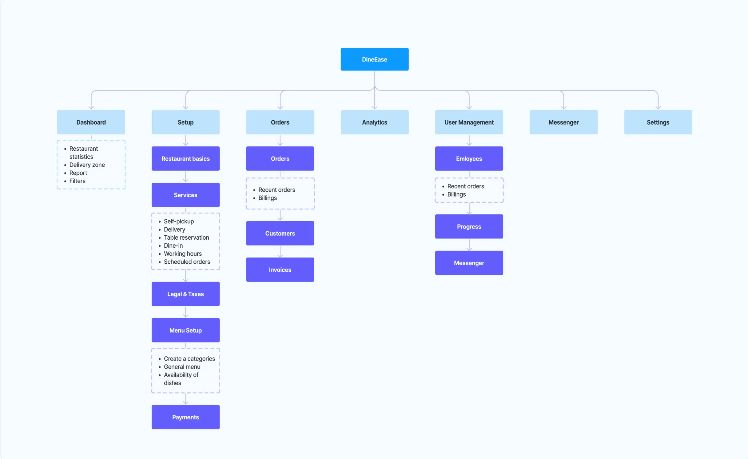
I mapped the information architecture first - how Dashboard, Setup, Orders, Analytics, User Management, Messenger and Settings relate to each other and to their own sub-sections - so navigation came from how a restaurant is actually organized, not from whichever screen got designed first. From there I worked with the development team in agile sprints, building the owner-facing and staff-facing workflows side by side rather than one after the other.
Every screen had to work standing up, mid-shift. Not sitting down with a coffee.
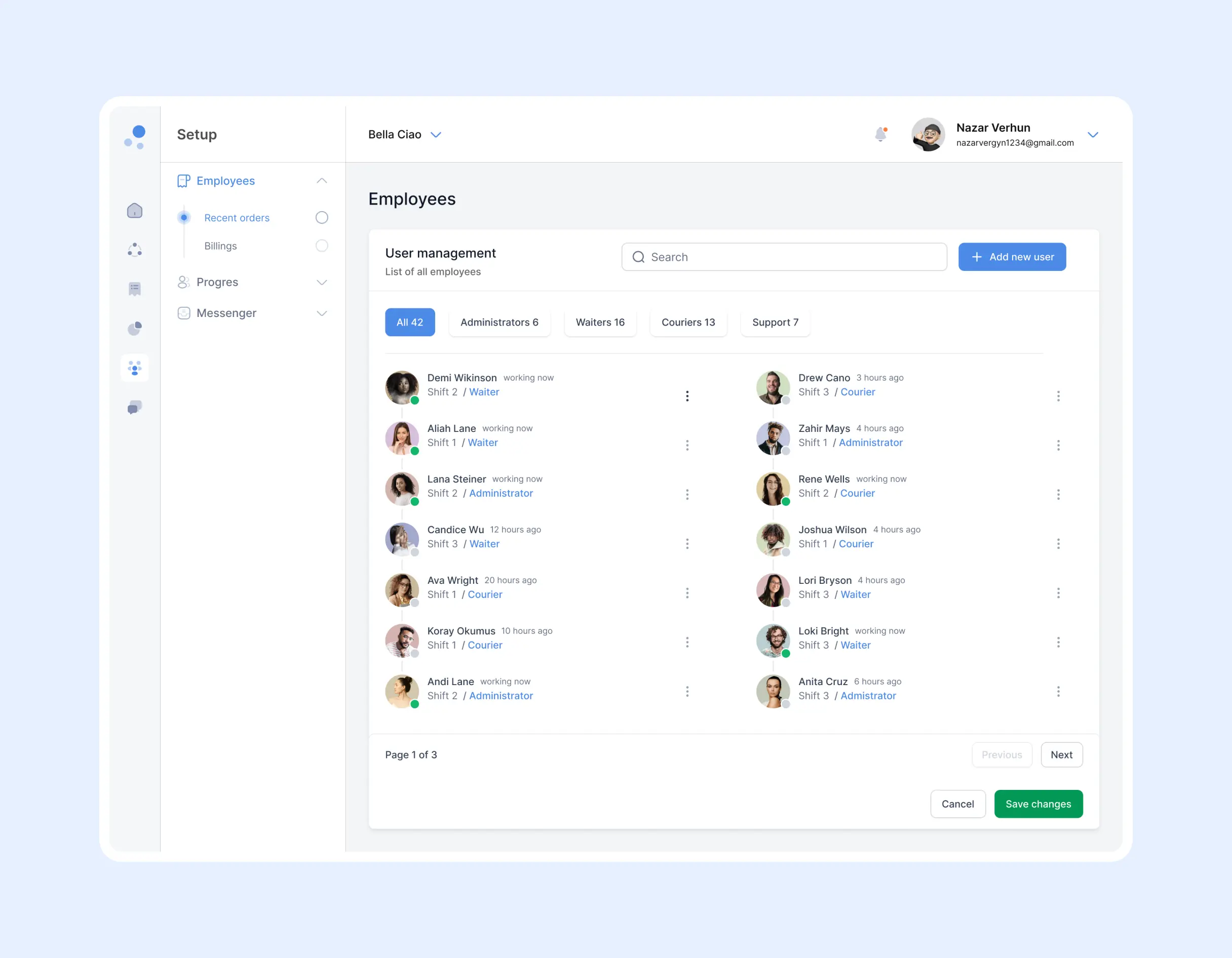
During service - staff & shifts
Information architecture
The sitemap below is the actual structure I built: seven top-level areas, each broken into the sub-sections staff use daily. Setup alone holds six of them - restaurant basics, services, legal & taxes, menu setup, payments - kept as one branch instead of scattered through the app, which is what makes the rest of the dashboard feel shallow rather than nested three menus deep.
Process
Studied how fast-casual counters and fine-dining floors actually run service, to find where separate tools were costing time.
Built the information architecture - the seven-area sitemap - before any screen was drawn.
Worked with full-stack developers in agile sprints, designing owner and staff workflows in parallel.
Rebuilt the sequence of common tasks into a logical order of steps so staff could move through it without stopping to think.
During service - orders
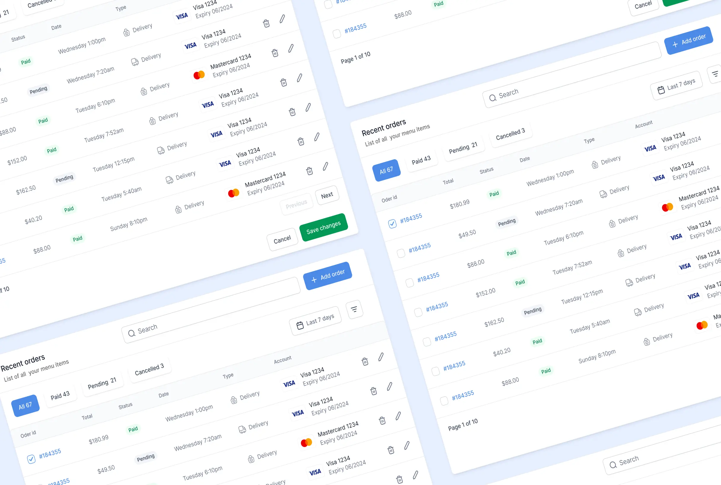
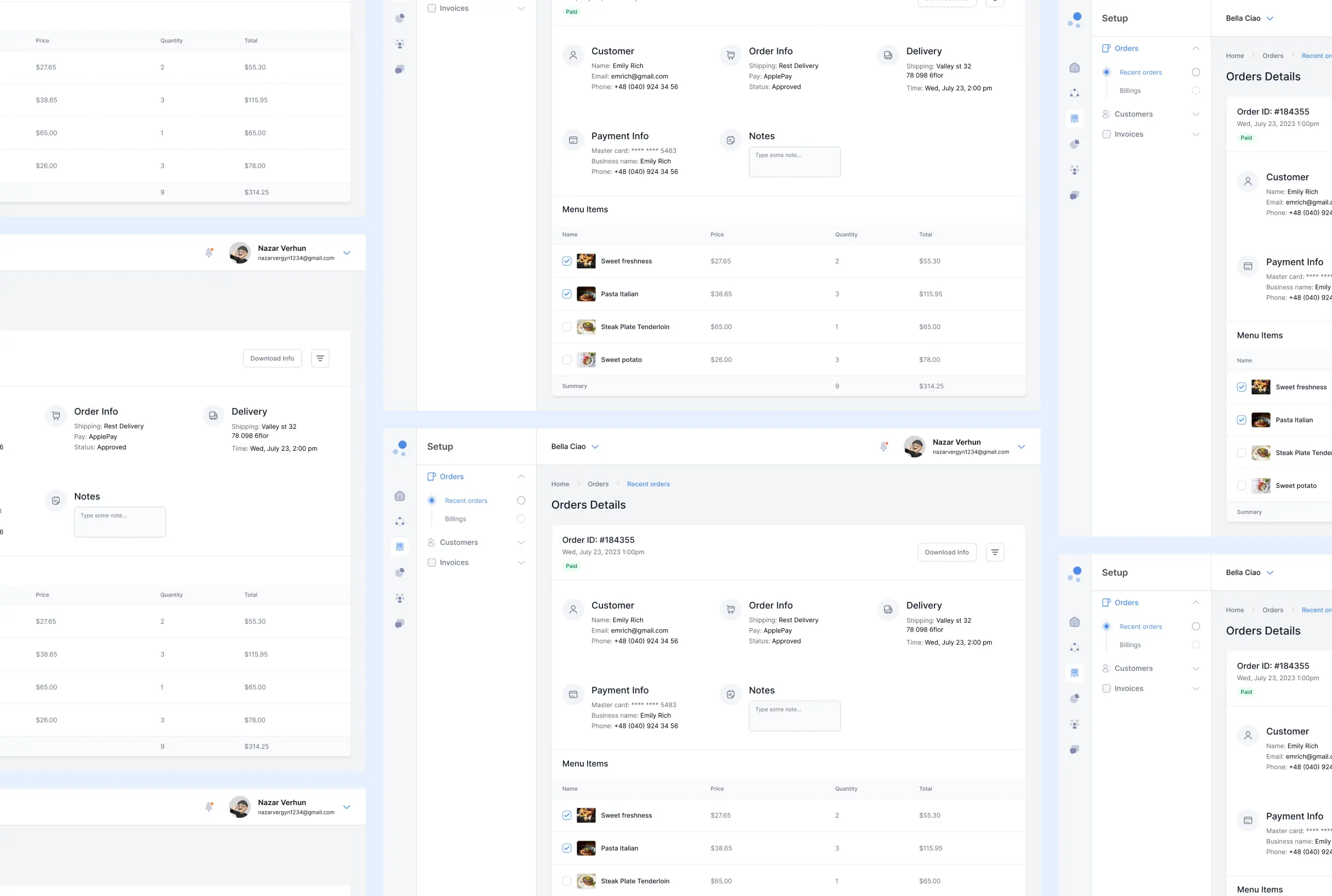
Orders is where the shift actually lives: every order comes in tagged Paid, Pending or Cancelled, with its total, its type (Delivery, self-pickup...) and the card it was paid on, filterable by date range. Opening one drops into Order Details - customer contact, order and delivery info, payment method and a running dish-by-dish total, plus a free-text notes field for anything that doesn't fit a form field.
Design decisions
Delivery pricing is set on a map, not typed into a list of postcodes.
An owner drawing a zone by hand sees exactly which streets it covers as they draw it; a table of postcodes hides the same information behind reading, and a radius fee only makes sense in the context of an actual map.
Menu items are photo cards grouped by category, never a plain text table.
A cook or a waiter recognizes a dish from its photo faster than from its name - especially for a category like "A set of goodies" that doesn't describe itself in words - so the grid keeps the photo, price and category together on one card.
One Order Details screen holds the customer, the payment, the delivery and the dish breakdown together.
Resolving a complaint or a late delivery means having all four in view at once; splitting them into separate tabs would cost a click every time someone at the counter is asking about an order.
Outcome
DineEase replaced several separate systems with a single dashboard for menu, orders, inventory, staffing and delivery. Navigation was rebuilt around the platform's actual core functions, the interface reworked for clearer, more efficient use, and the sequence of common actions rebuilt into a logical order of steps - the result is a faster, more comprehensible product that staff can learn quickly and run with confidence under pressure.