Architecture & construction - 2023–2025
A brand identity and a corporate website for a Dubai architecture and construction firm, built to hold finished renders and the concept sketches behind them without one undercutting the other.
The problem
Federal is an architecture and construction firm in Dubai working with developers like wasl properties, SPEC and SOL Properties, but it had no identity system and no site built to carry that work. A prospective client sizing up an architecture firm is partly judging the renders and case work it can show them - Federal had neither a mark nor a page built for that job.
The brief covered both ends of it: build a visual identity from nothing - logotype, typography, colour, physical brand touchpoints - then a responsive site to put it to work across a home page, a services overview, a concept-design showcase and a contact page with the Dubai office on a map.
Approach
I started with brand analysis and discovery workshops to understand Federal's positioning, then competitor research, and only after that a complete visual identity - logotype, typography, colour - before opening a single website screen. The site was designed against a system that already existed, not one improvised a page at a time.
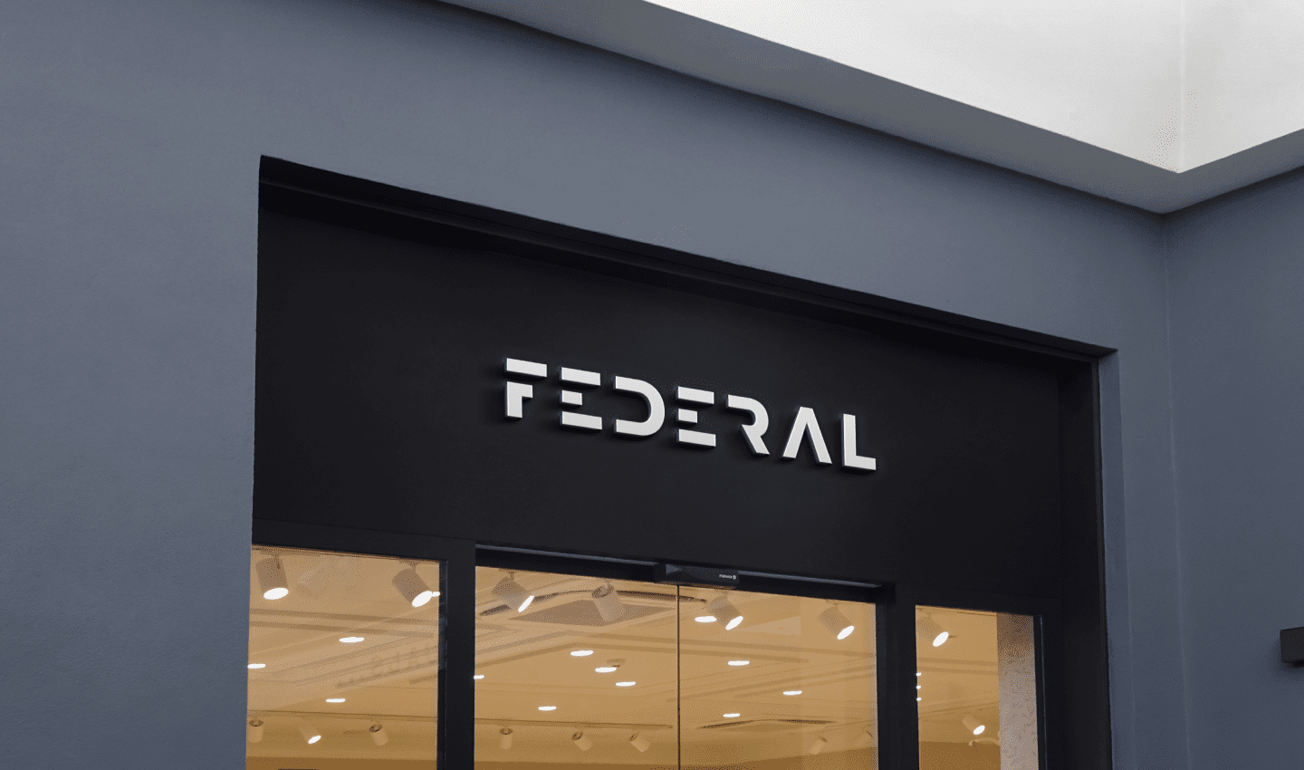
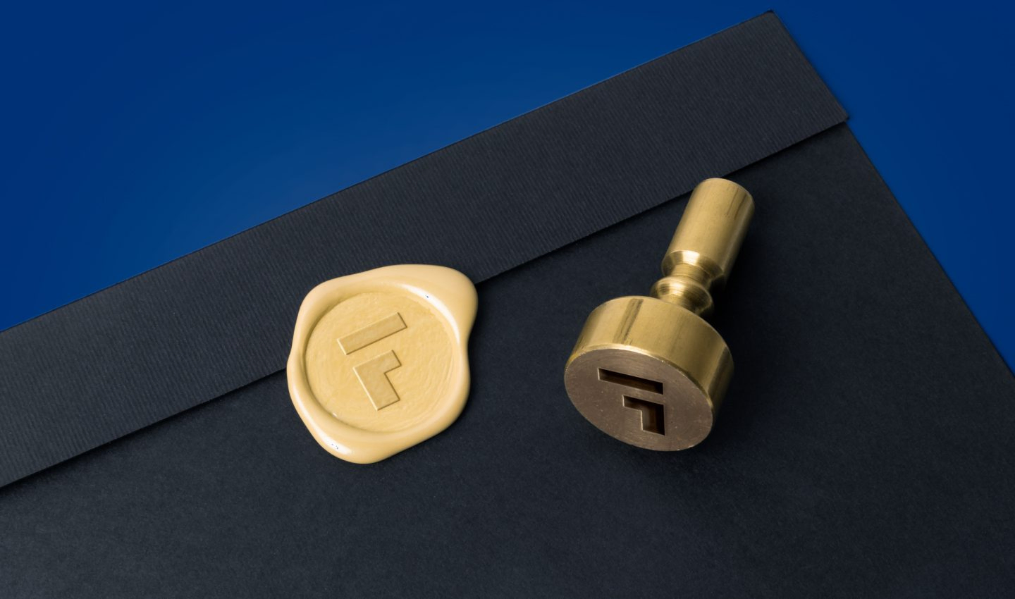
One mark, cut into metal and printed on a lanyard, reading the same as sixteen pixels in a browser tab.
Identity
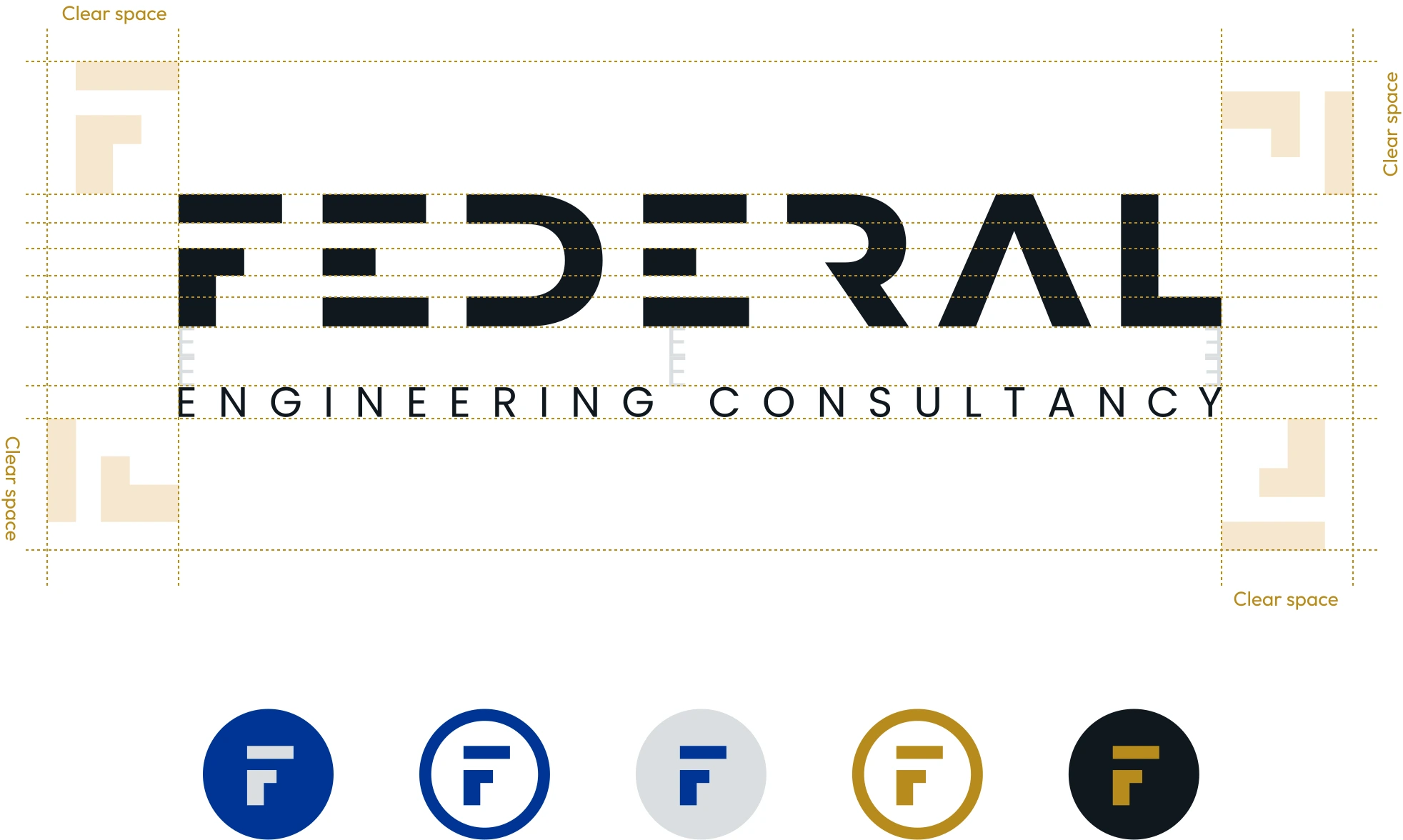
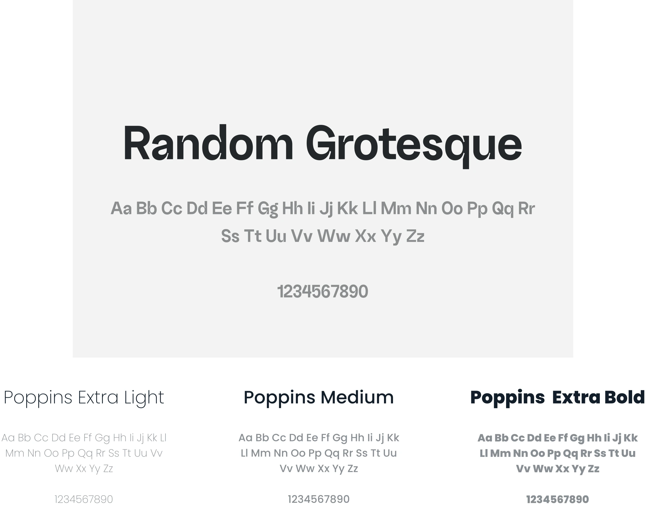
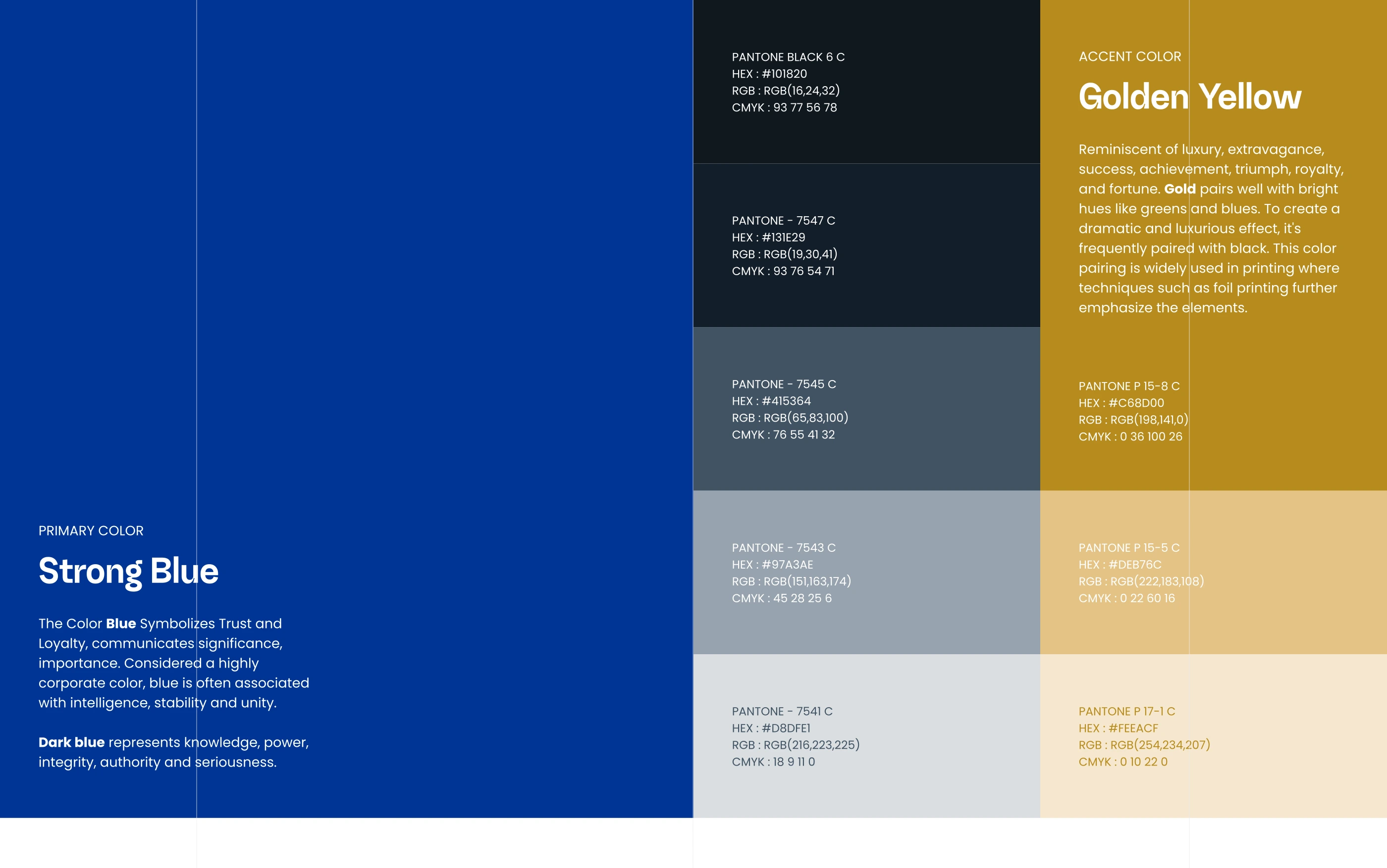
The logotype's sliced, angular letterforms read as structural - clean lines standing in for the firm's engineering work - and stay legible from a favicon to a shopfront sign. Random Grotesque carries headlines, Poppins runs body copy across three weights, and the palette pairs a strong corporate blue with a golden-yellow accent Federal's own brand notes tie to achievement and gold-foil printing.
Off the screen
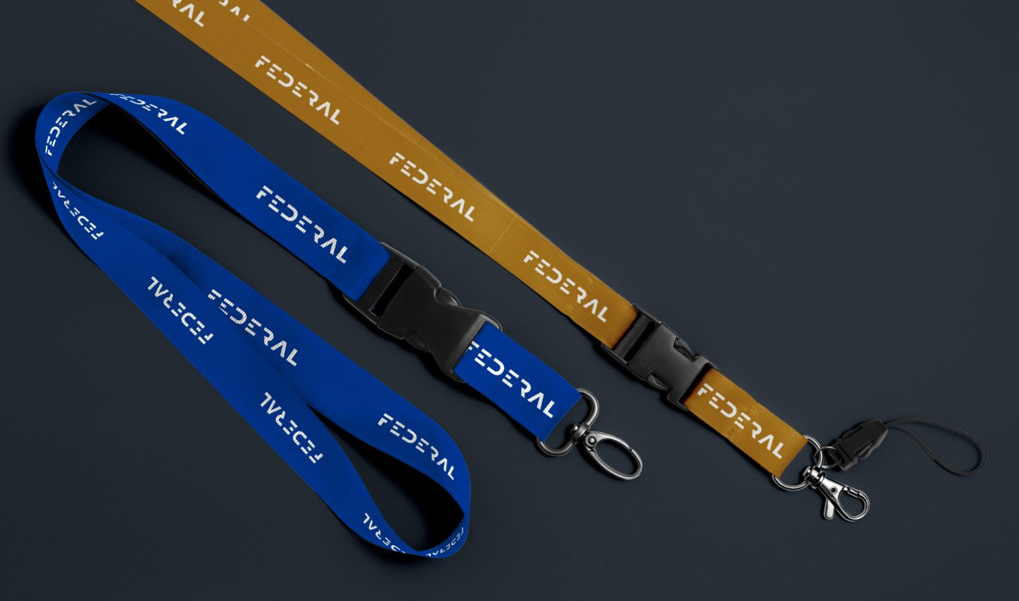
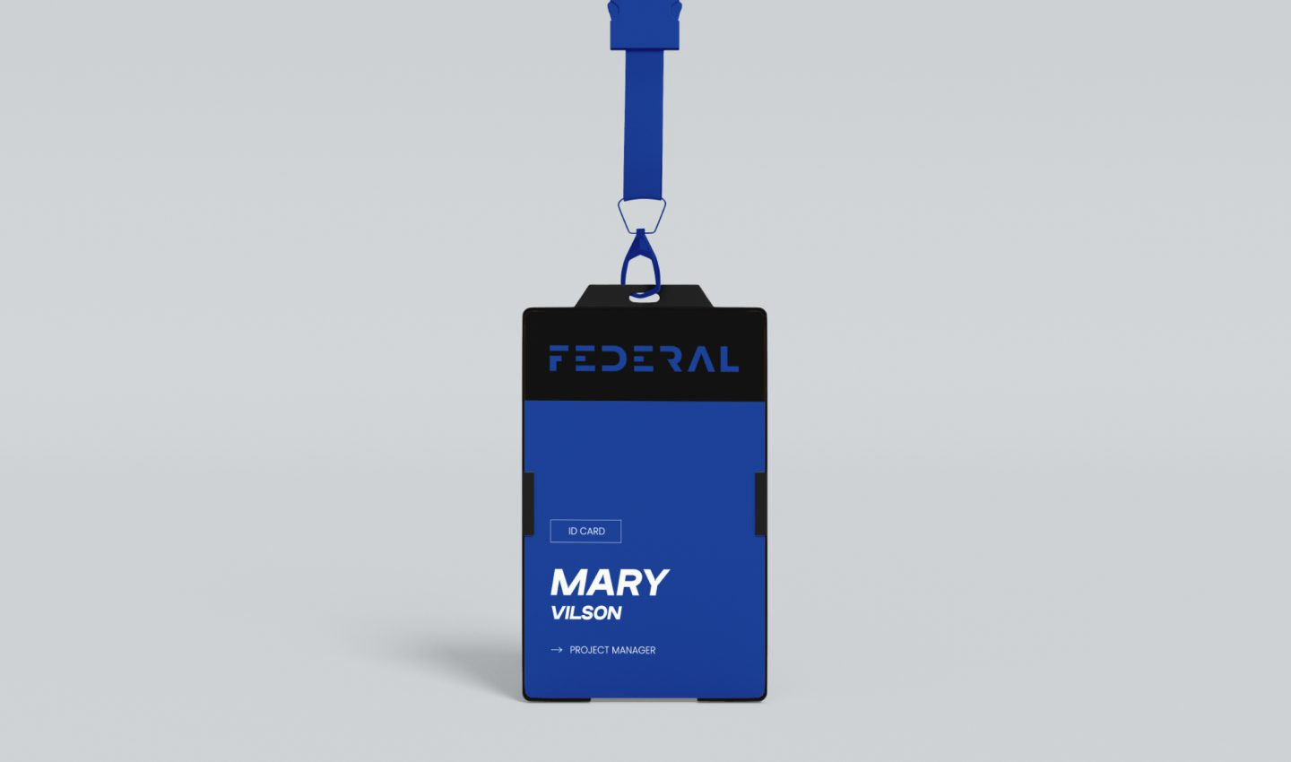
The identity had to survive being printed, not just rendered. Event lanyards, staff ID badges and a wax-seal stamp all carry the same F mark in the same handful of colours, so nothing needed reinventing every time it left a screen.
Structure
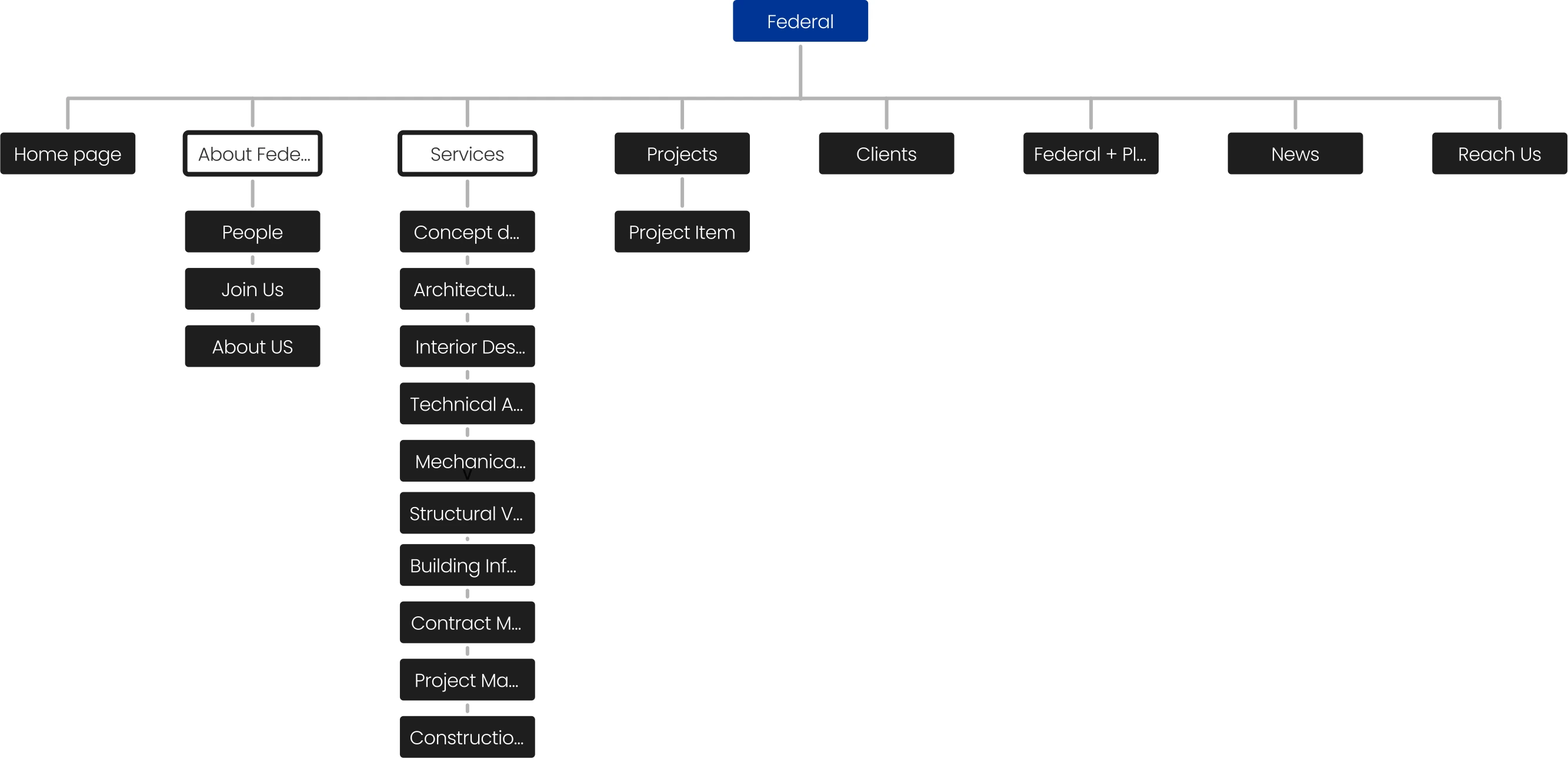
The sitemap keeps most of the site one level deep - Home, Projects, Clients, News, Reach Us - and reserves the depth for two branches: Services, which breaks into ten sub-pages running from concept design through construction management, and About Federal, with three. That's where a firm like this actually has range to show, so that's where the site carries room for it.
Wireframes
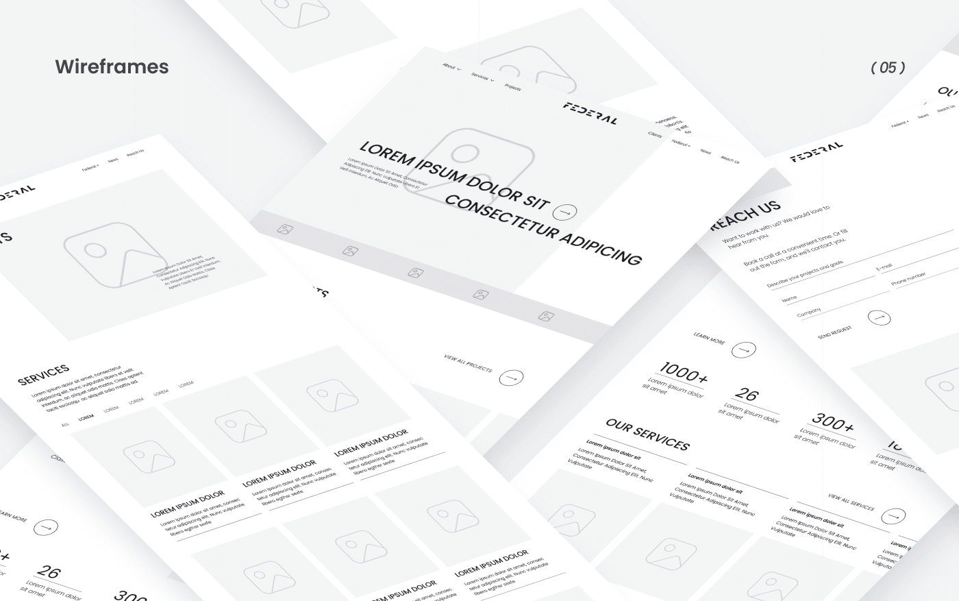
Layout and hierarchy got settled in wireframe first - where the hero sits, how the services grid breaks into columns, what the contact form asks for - so the high-quality visuals the brief called for landed on a structure that was already right, instead of papering over one that wasn't.
Home page
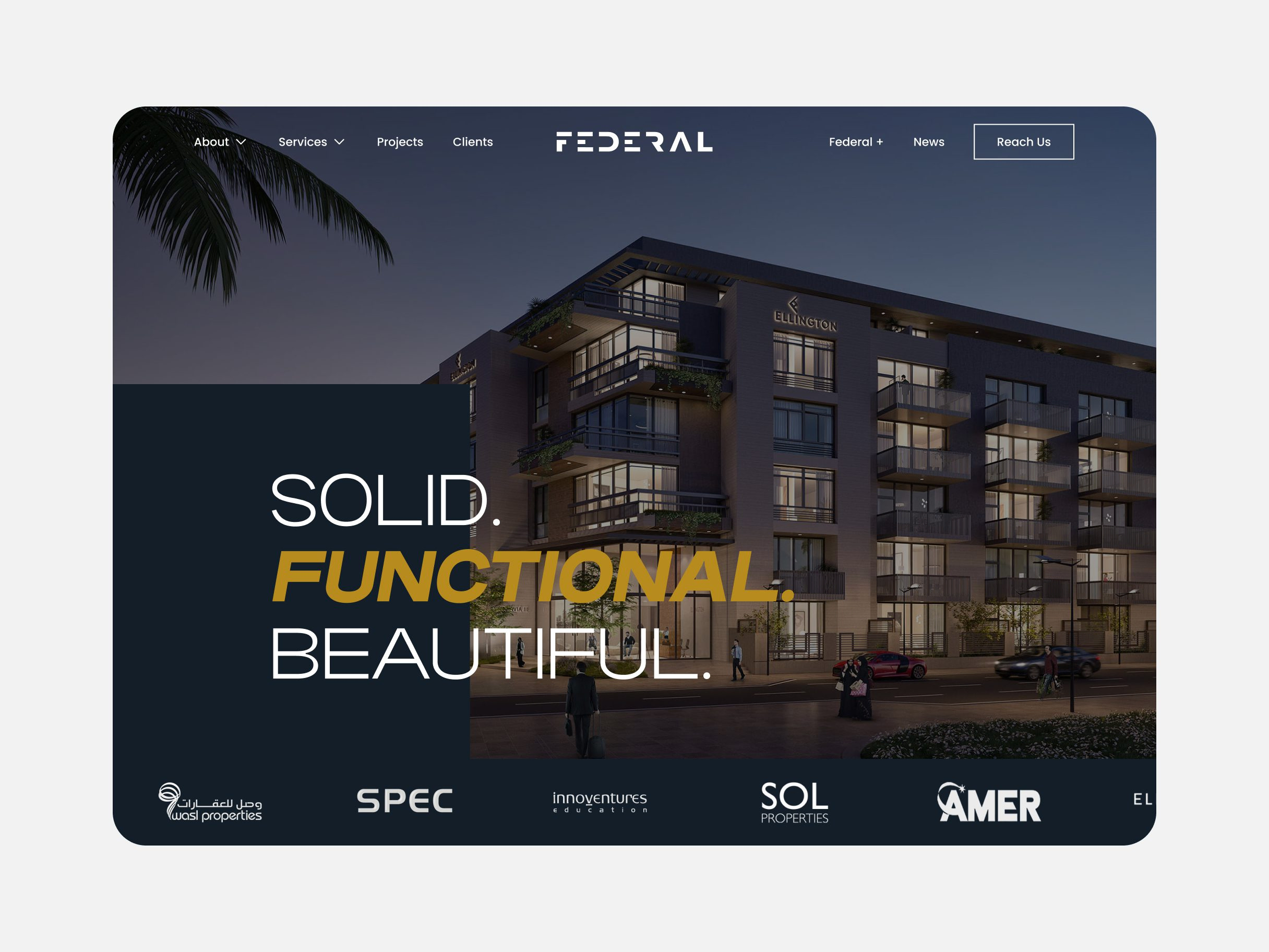
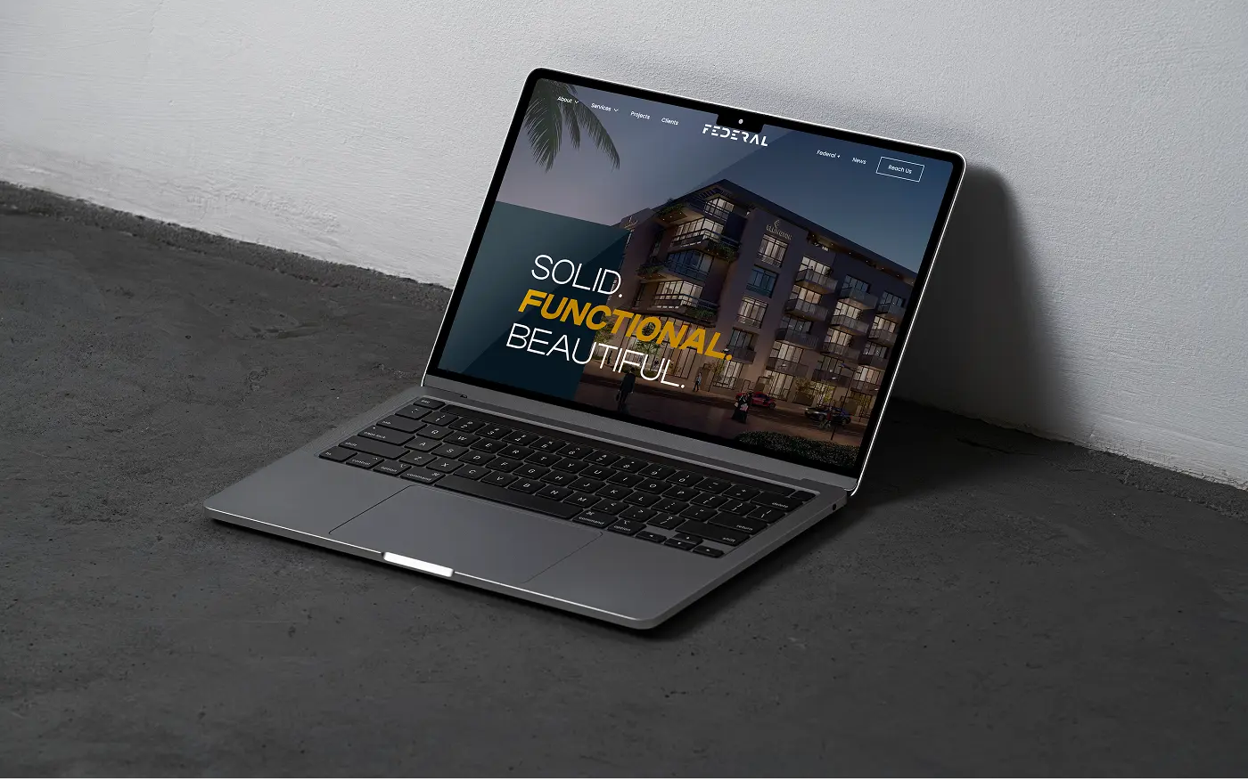
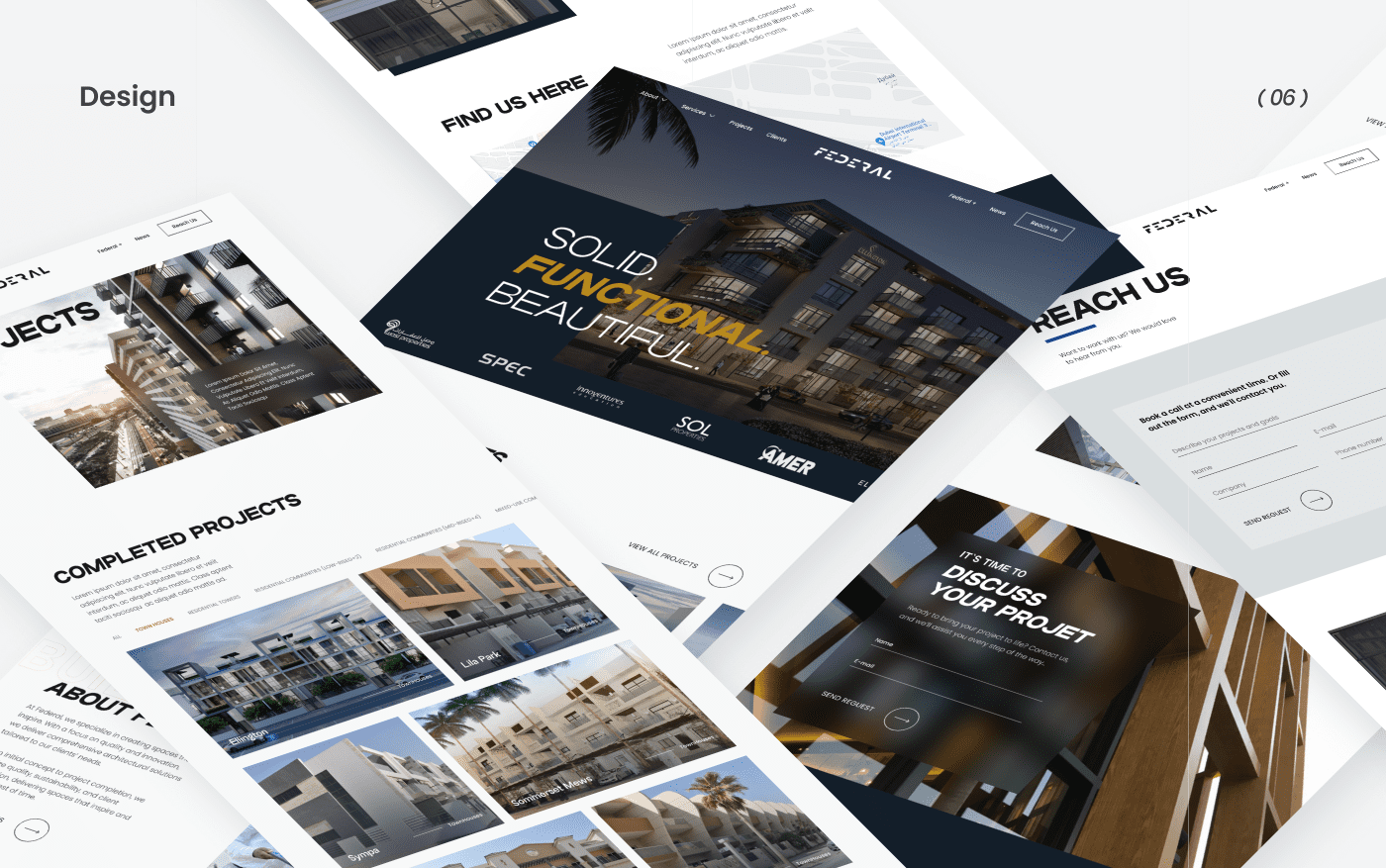
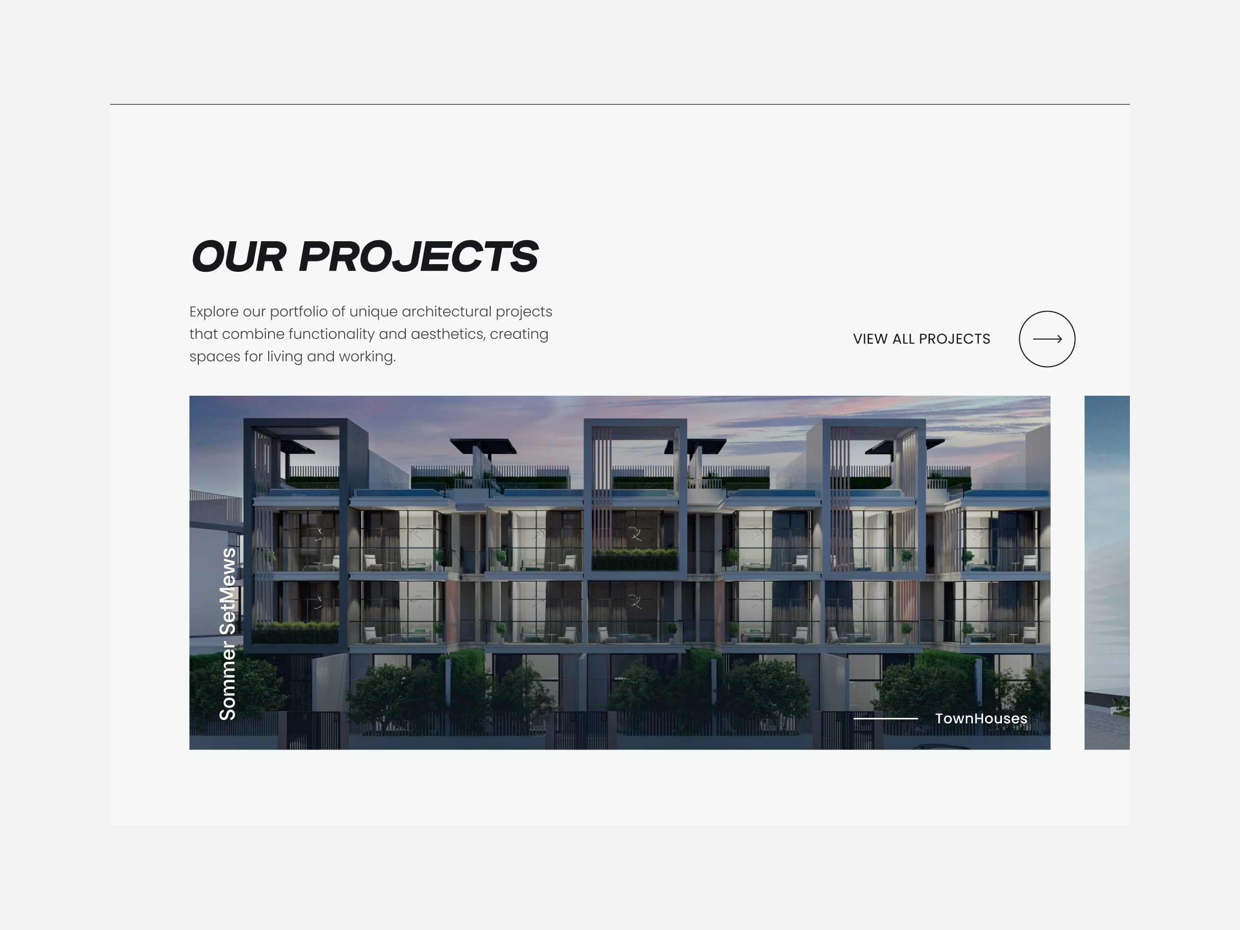
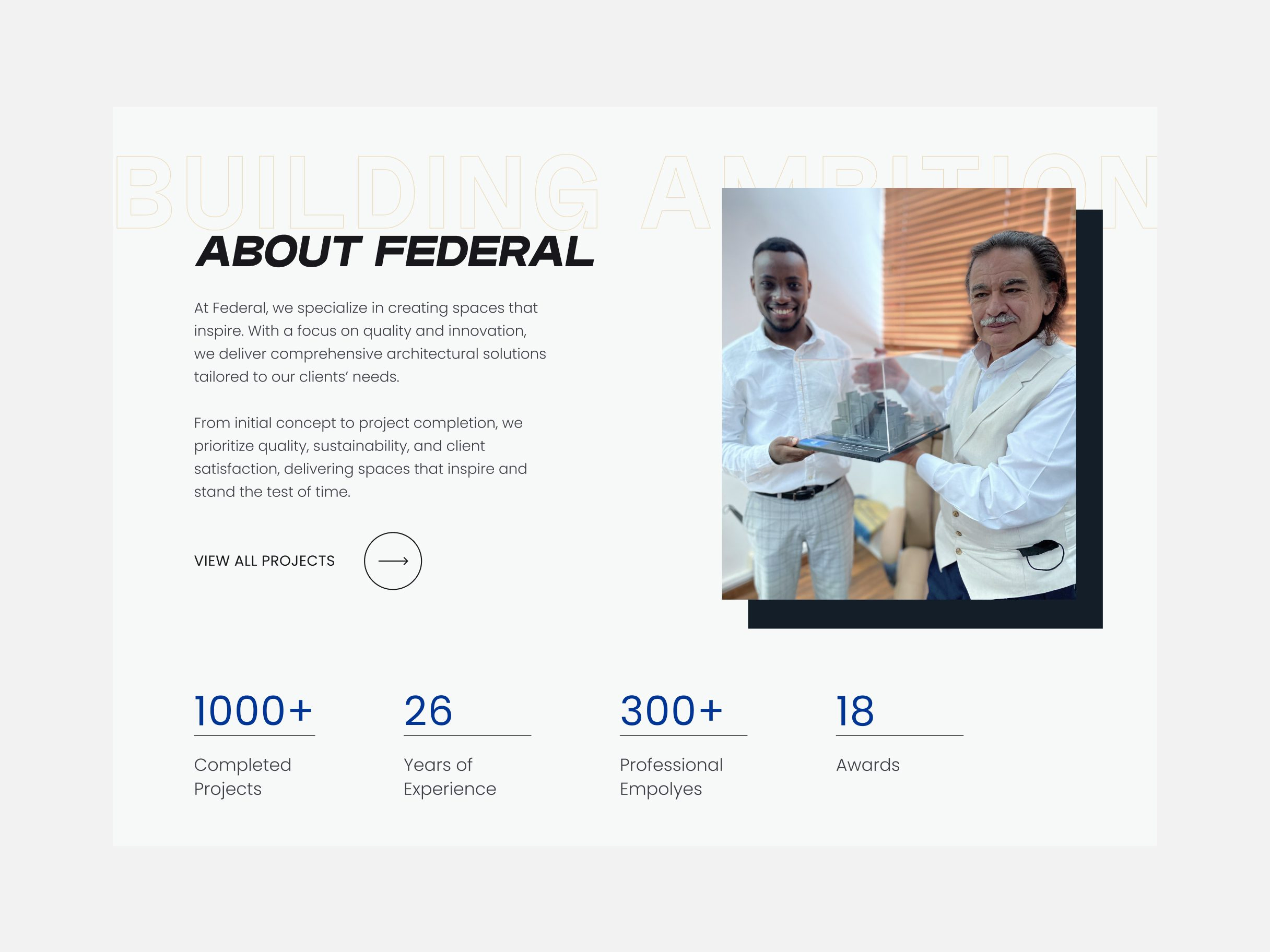
The home page opens on a full-width dusk render of a completed building and three words - Solid. Functional. Beautiful. - restating Federal's stated values in the client's own order. Underneath, a horizontal projects strip and an about section with four stat call-outs carry the rest of the pitch before the page ever asks for a click.
Concept design
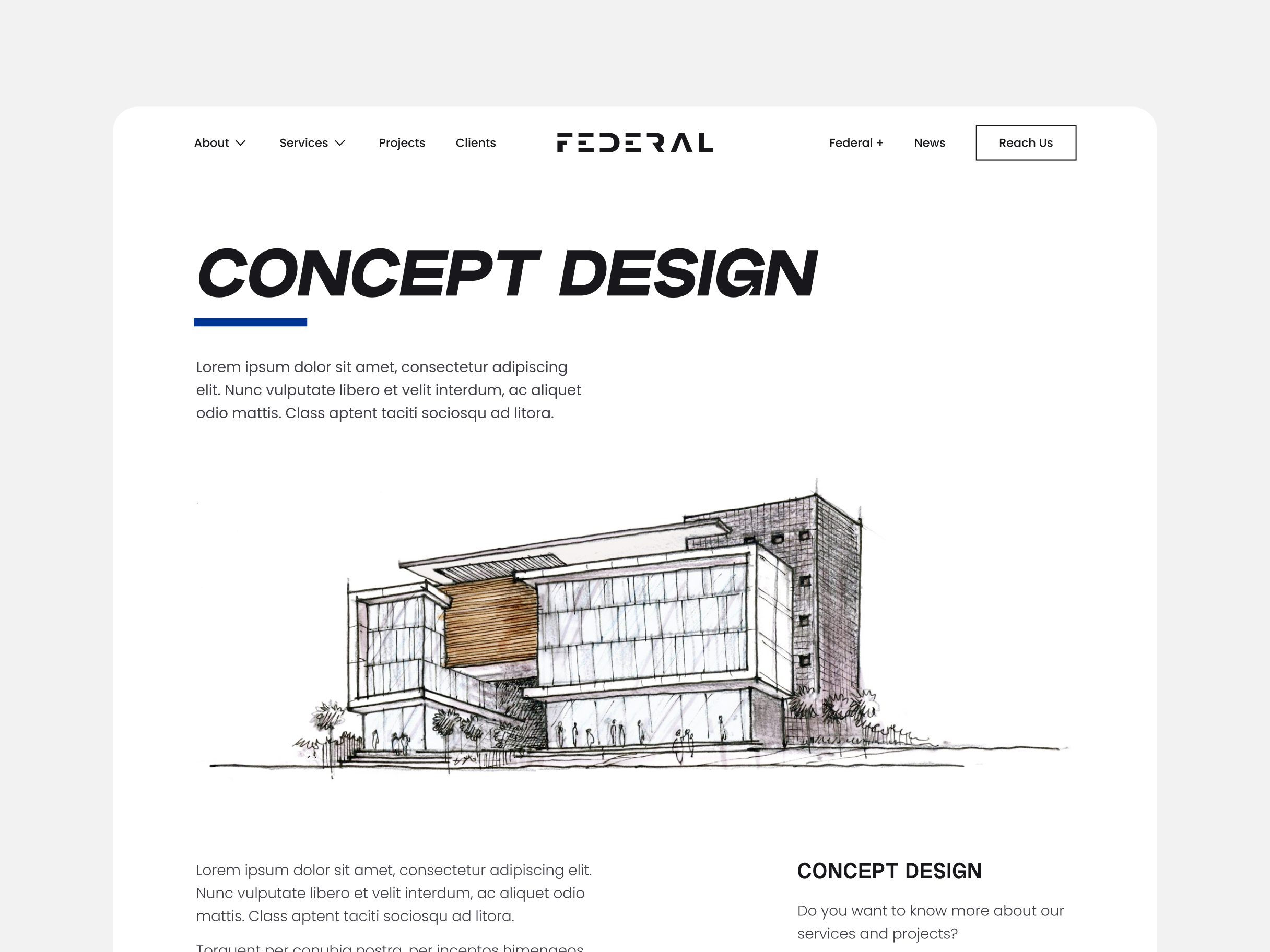
Most of the site runs on photoreal renders. The Concept Design page breaks that pattern on purpose - a hand-drawn elevation, generous white space and a design quote standing in for the earliest, least-finished stage of the work.
Additional pages
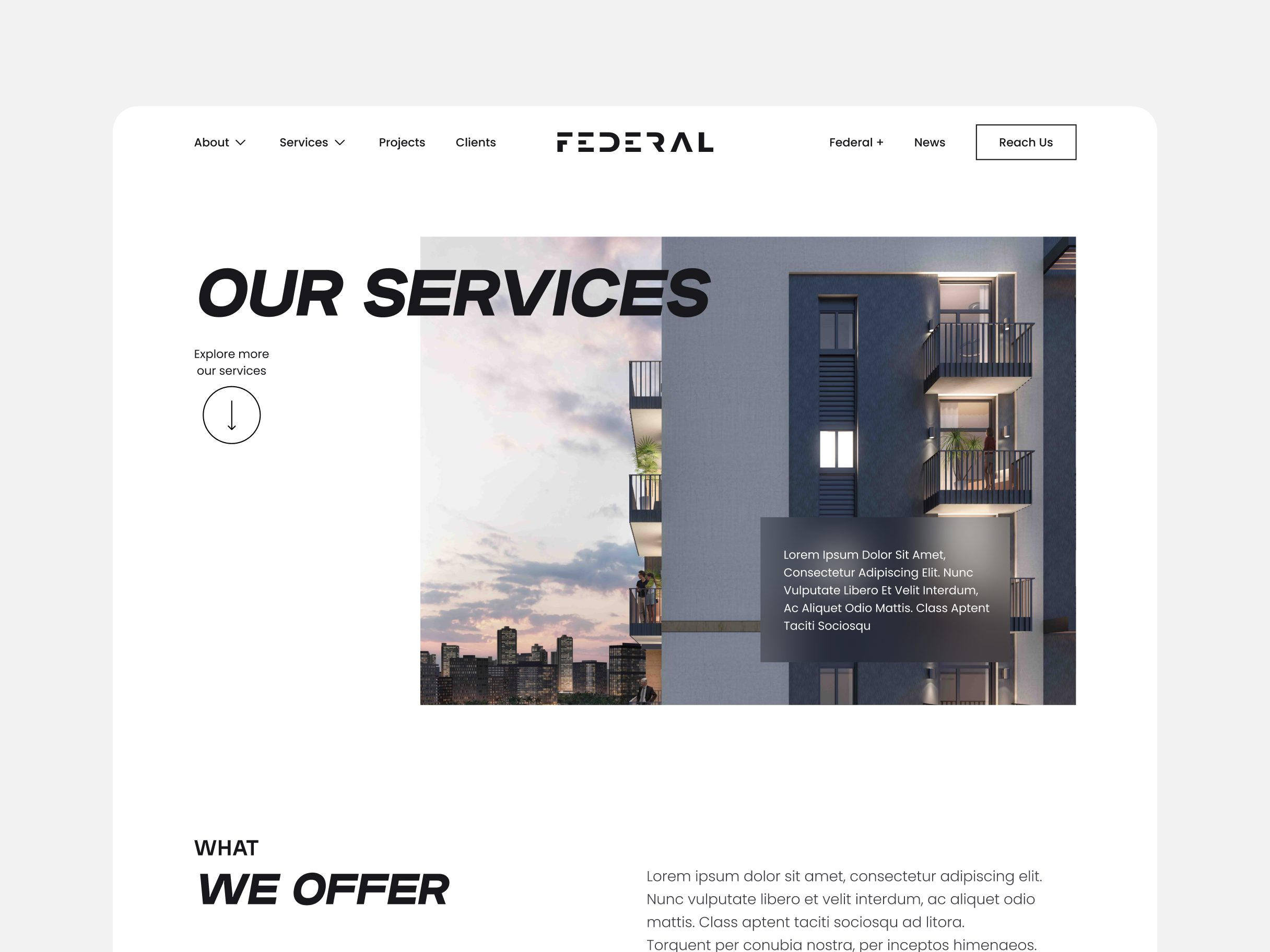
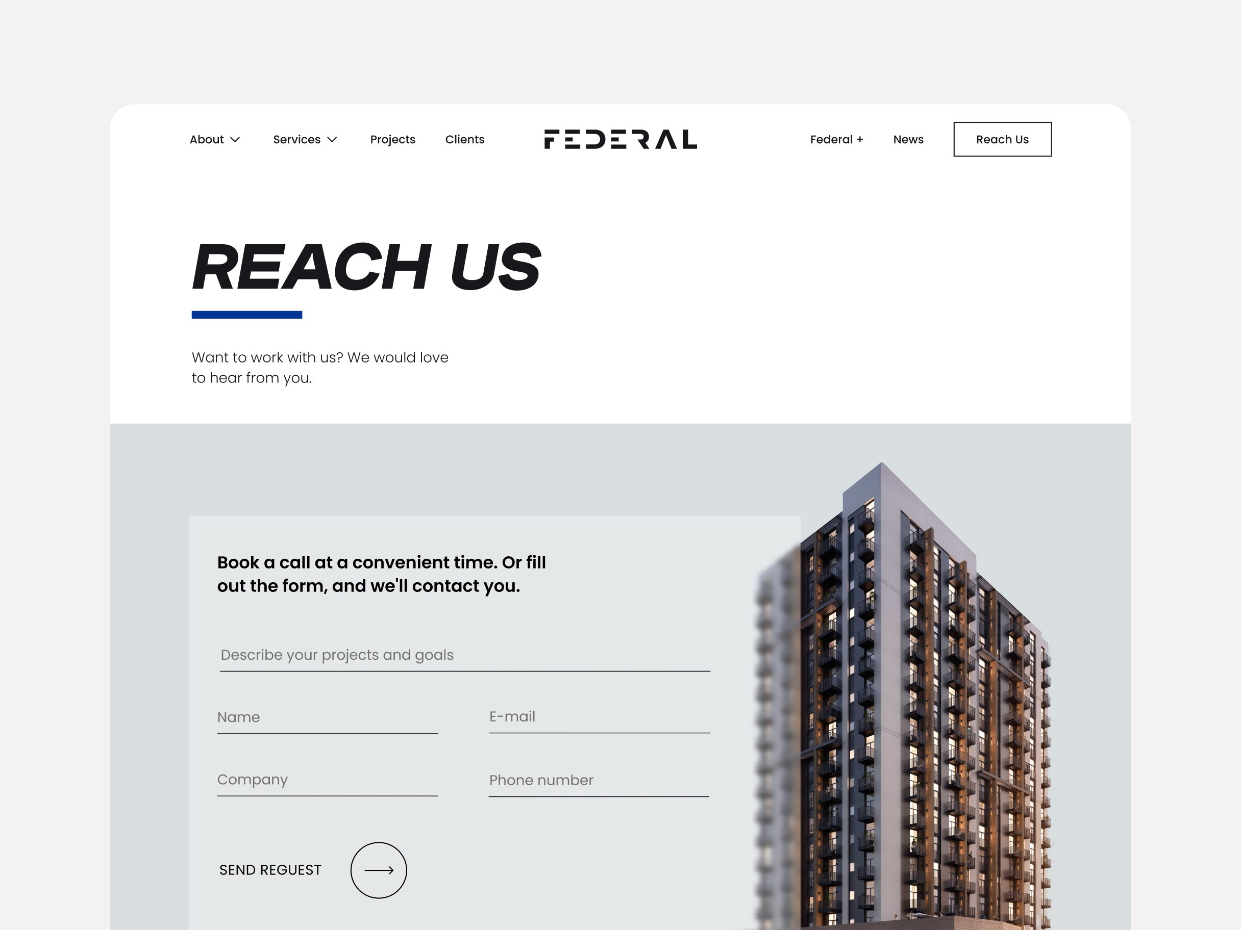
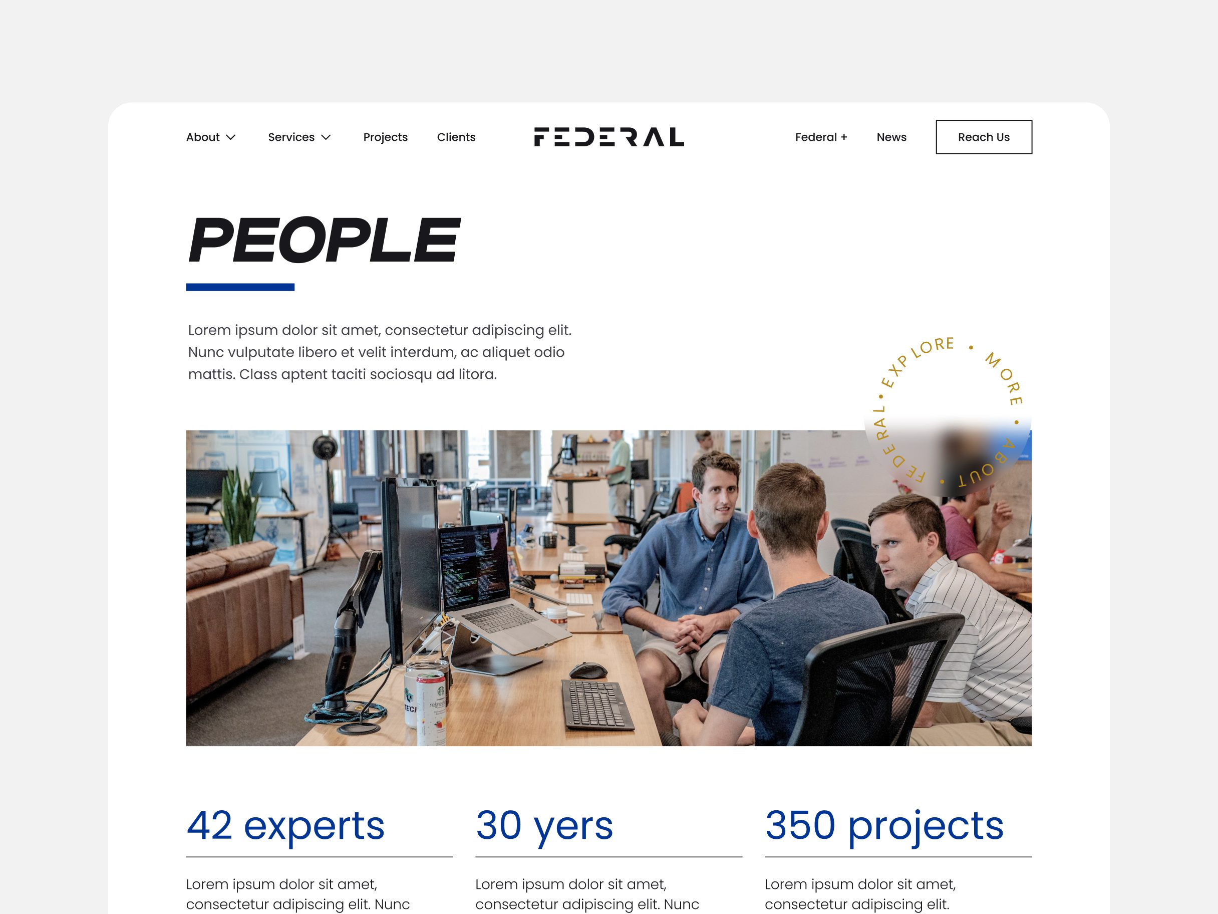
Services, Reach Us and the About Federal sub-pages all open the same way - a headline, a short underline rule, a line of intro copy - before doing their one job: a services grid, a contact form next to a Dubai map, a team photo next to a headcount. Nothing about the format tries to be different from page to page.
Process
Brand analysis and discovery workshops on Federal's positioning, followed by competitor research.
Logotype, typography, colour and physical brand touchpoints, finished before any screen design started.
Wireframes, then the home page, services, concept-design and contact pages, all on the same structural skeleton.
A responsive site with an embedded Dubai map and contact form, on maintainable code.
Design decisions
Finished the identity system before opening a single website screen.
Brand analysis, competitor research and a complete logotype, type and colour system all happened before website design started. A site built against a locked identity inherits a finished system; one built alongside an identity still in progress means re-deciding brand choices and interface choices at the same time.
Gave every additional page - Services, Reach Us, the About Federal sub-pages - the same opening structure.
Headline, underline rule, intro line, then the page's one job. For a firm selling structural precision, pages that all snap to the same skeleton read as more disciplined than pages that each try something new.
Gave the Concept Design page a hand sketch instead of another finished render.
The rest of the site runs on polished, photoreal work. One page showing the process behind it - sketches, generous white space, a design quote - tells a prospective client the firm draws before it renders, which a catalogue of finished buildings can't say on its own.
Outcome
The result restructured Federal's site around its own story - company, services, portfolio - in that order, with a consistent layout, bold typography and the blue-and-gold identity running through every page. An embedded Dubai map and a contact form now anchor the Reach Us page, and the whole build is responsive down to mobile.