SaaS & Cloud Platforms - 2023–2025
A VPN sold on being the fastest, designed as one connect button and the plan, billing and device screens around it - repeated, unchanged, across iOS, macOS and the web.
The problem
A VPN's whole job happens where you can't see it: connected or not, routed through which country, actually private or not. Bayria's pitch was speed on top of that - a claim that's even harder to show on a screen than "secure" is.
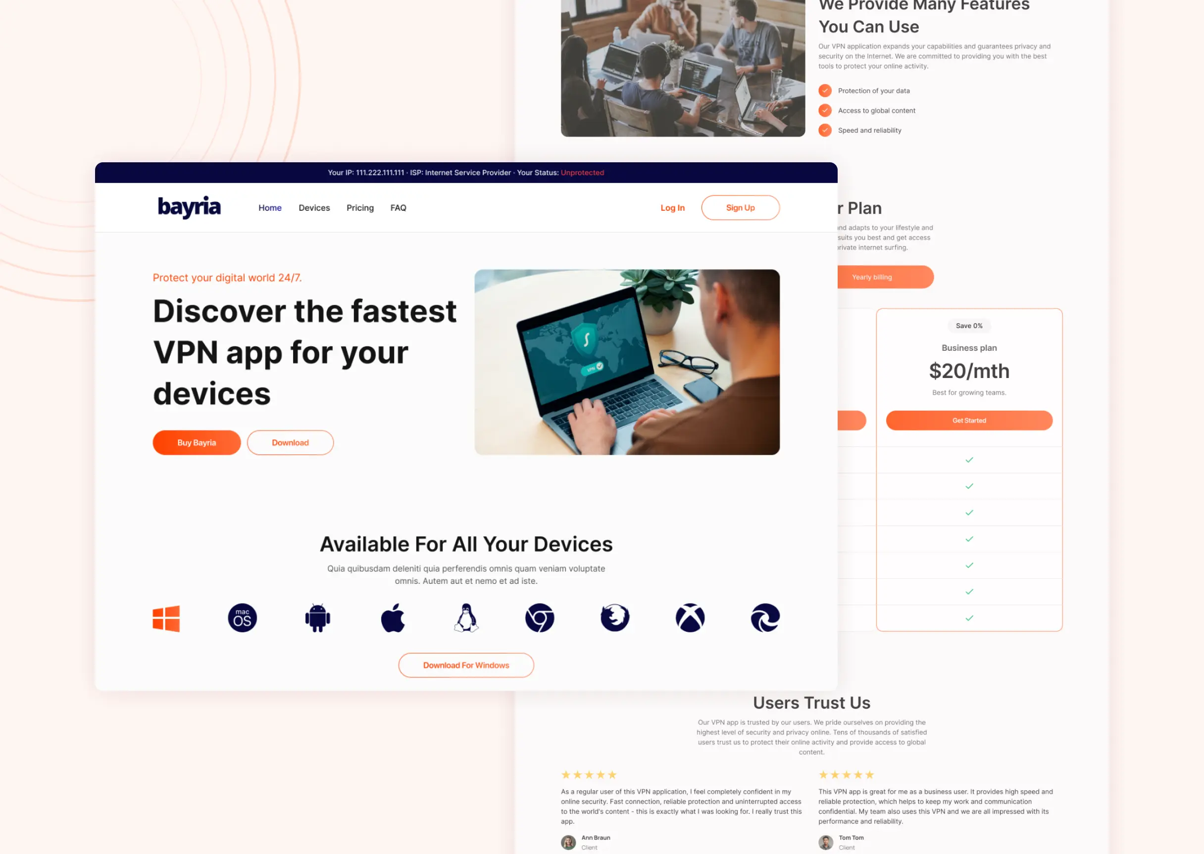
The brief covered five surfaces at once - the iOS app, a desktop client, a macOS panel, a SaaS dashboard and the marketing site - and all of them had to answer the same question the same way: is it on, and can I trust that it's on.
Approach
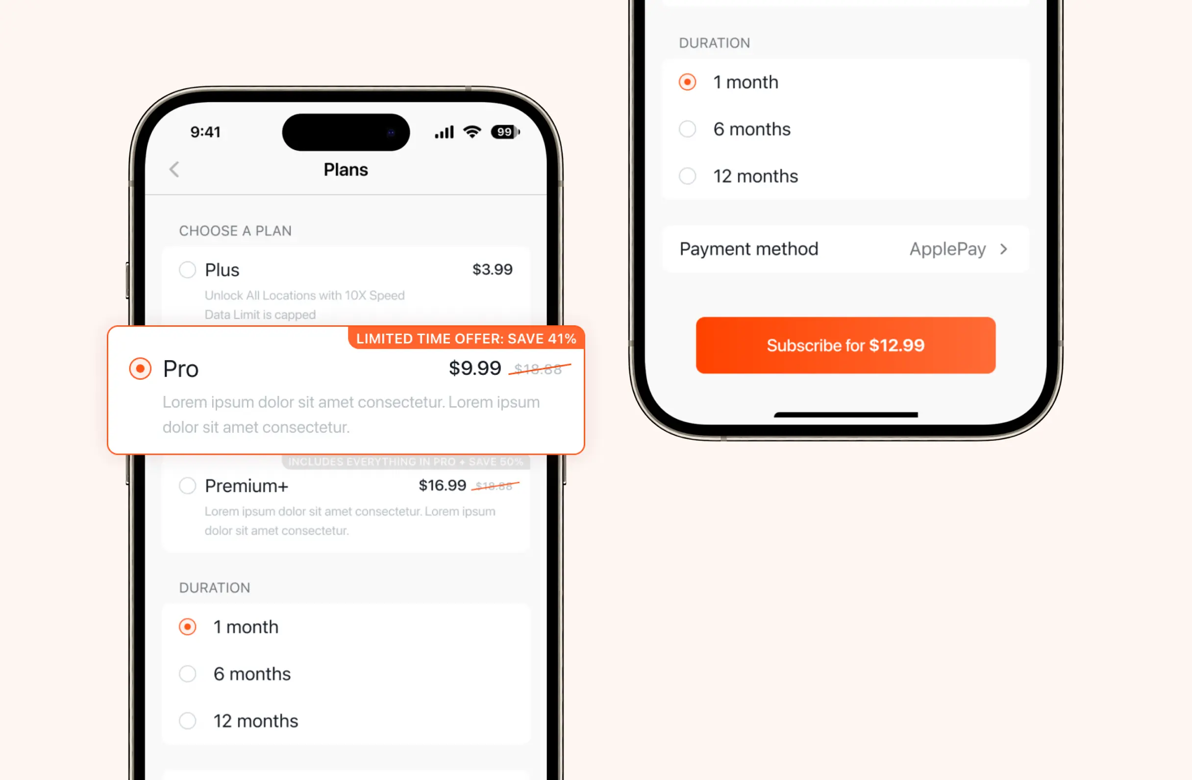
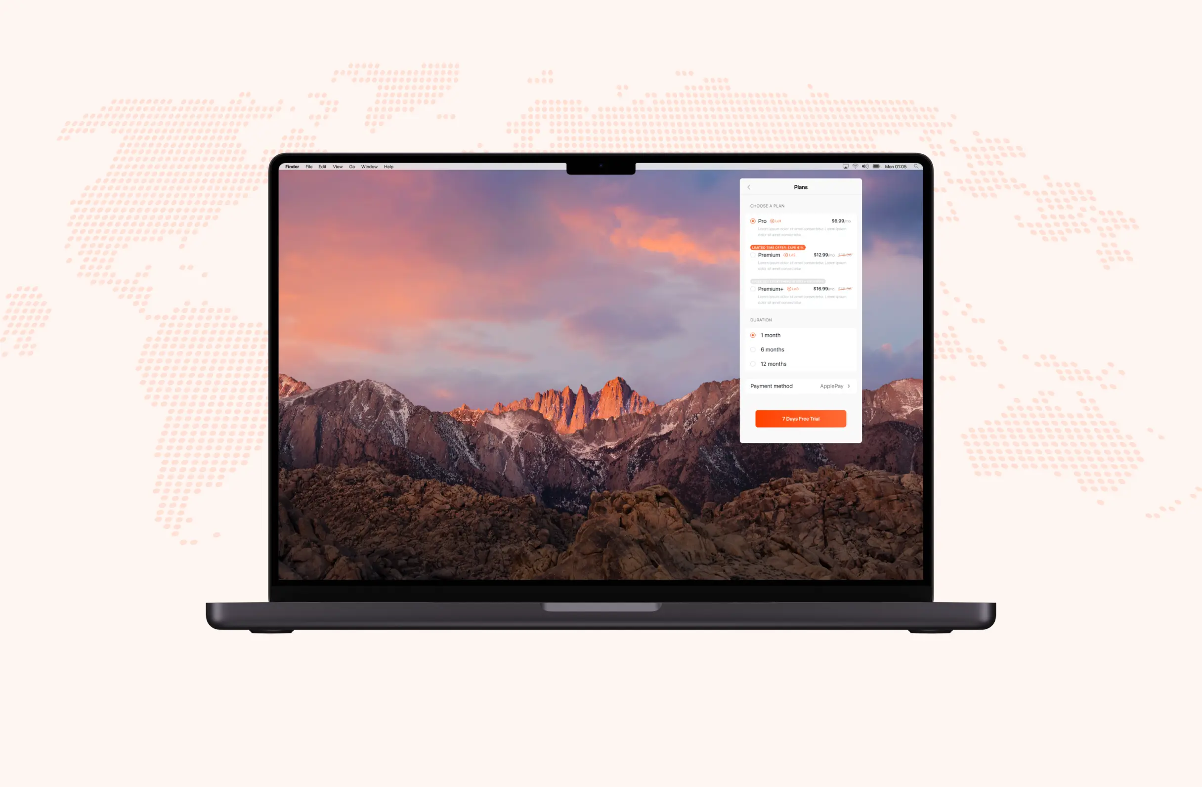
Instead of designing three separate purchase flows, I built a single plan → duration → payment pattern and shipped it unchanged on iOS, on macOS and on the desktop dashboard. Orange stayed the one accent color across every surface - a status dot, a warning banner, a subscribe button - so it always meant the same thing: this is the part that needs your attention.
The same three steps everywhere plan, duration, pay - never redesigned twice.
Billing
On desktop, the same logic runs the other direction: the current plan and its price sit at the top, the card on file next to it, a paid-invoice history below, and changing plans opens a dialog that puts the two tiers side by side by what each one actually includes - seats and data, not just price.

Process
Studied VPN market requirements and what cross-platform security products need to get right.
Built one visual language - orange accent, shared components - meant to repeat across every platform.
Adapted the same connect, plan and billing structure to iOS, macOS, desktop and the web.
Delivered the app, desktop client, macOS panel and marketing site as one consistent product.
Design decisions
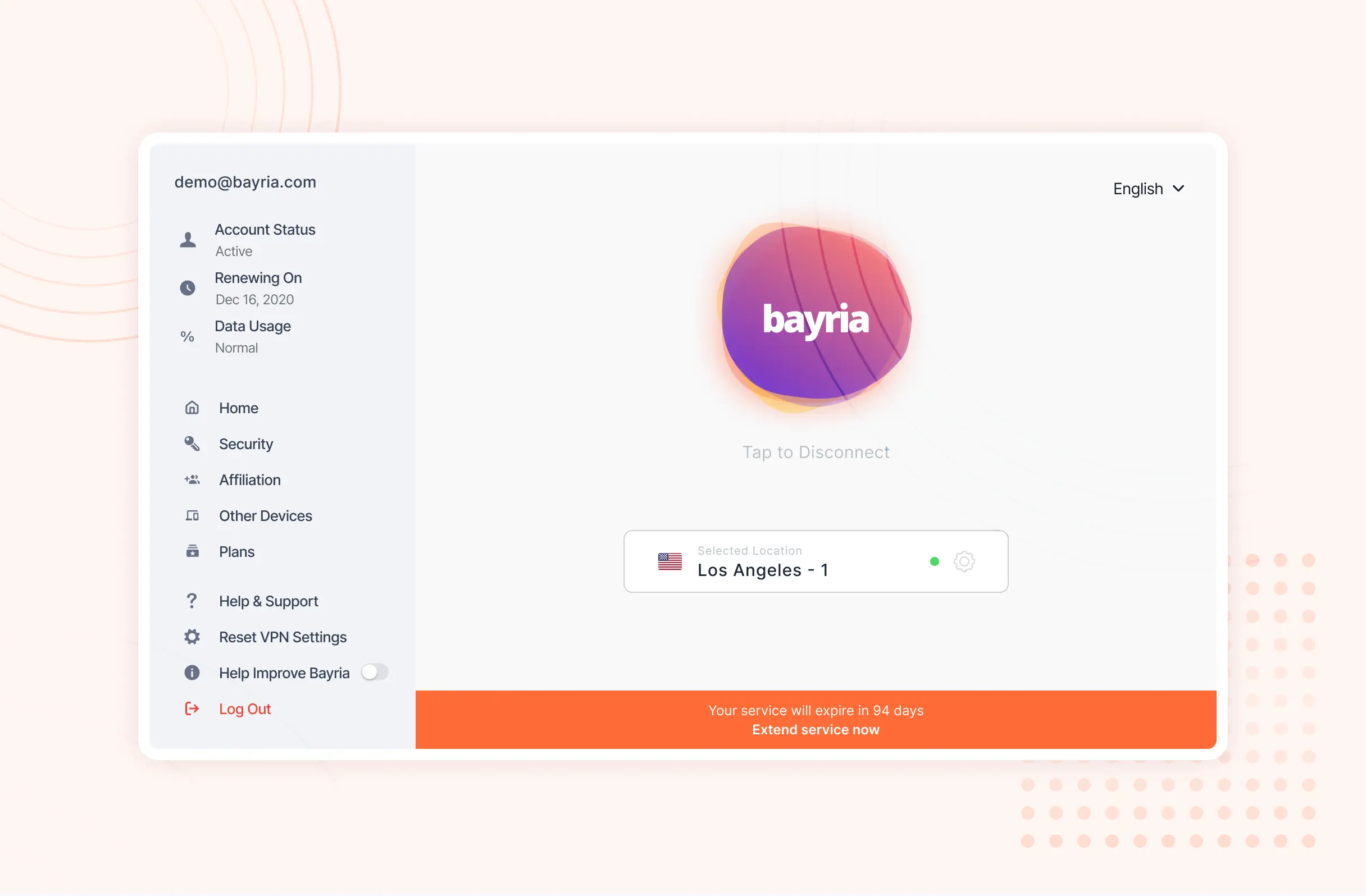
Put the connect toggle, the active server and the connection status on one screen, with nothing else competing for it.
A VPN app's one job is answering "am I protected right now" in under a second. Devices, security settings and the referral program all live one tap away in a side rail so none of them sit between the user and that answer.
Rebuilt the identical plan → duration → payment card on iOS, macOS and the desktop dashboard instead of designing three purchase flows.
Pricing screens are where people hesitate. A shape they've already learned once on their phone means one less thing to work out when they open the same decision on a laptop.
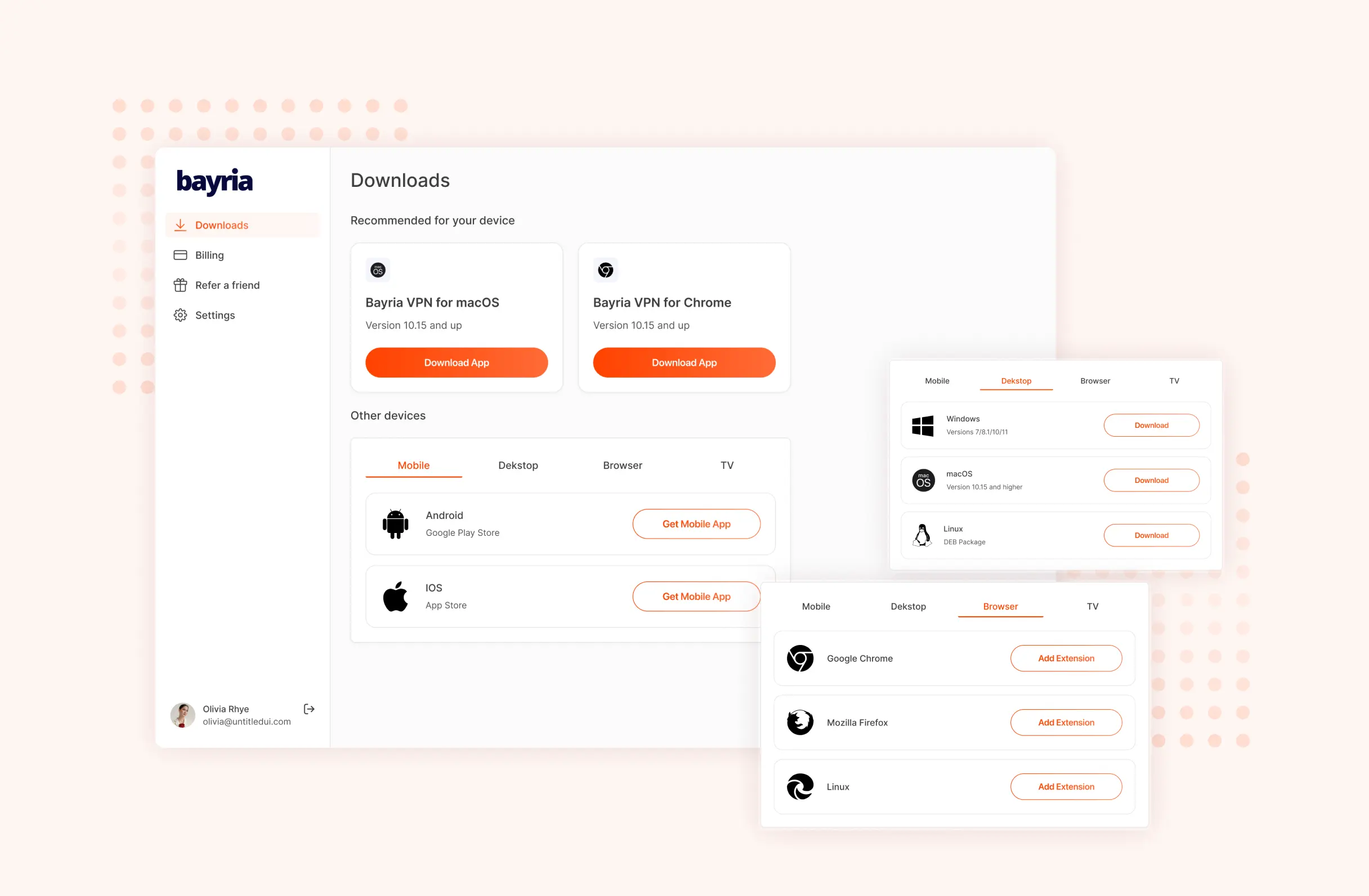
Put the full cross-platform download list inside the account itself, not only on the marketing site.
The person most likely to want Bayria on a second device is someone already paying for it on the first. An in-app Downloads screen turns that into one tap instead of a search.
Outcome
The app, the desktop client, the macOS panel and the marketing site ended up sharing one connect-plan-billing pattern and one accent color doing one job everywhere. A subscriber moving from phone to laptop to browser extension isn't relearning an interface each time - it's the same three or four shapes, in a different frame.